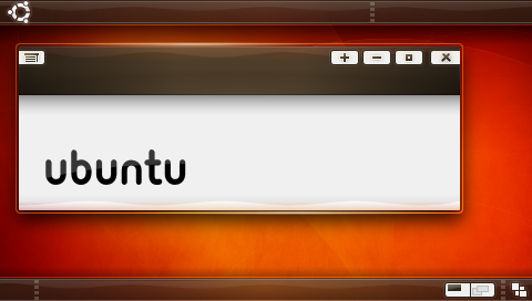
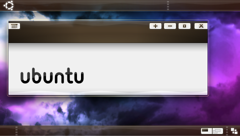
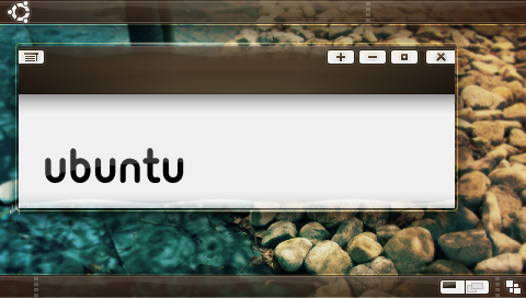
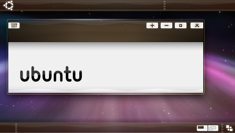
>
> New batch, I tried to get everyones ideas in here. The only thing I did
> differently from the suggestions was the buttons, the gray background to
> them just made it all feel more "solid".
>
> http://i4.photobucket.com/albums/y111/raraken/kin_piano_kith_r2.png
> http://i4.photobucket.com/albums/y111/raraken/kin_piano_clouds_r2.png
> http://i4.photobucket.com/albums/y111/raraken/kin_piano_rocks_r2.png
>
> http://i4.photobucket.com/albums/y111/raraken/kin_piano_trnthtfrnupsddwn_r2.png
>
> aaand... The development SVG. One thing about the SVG is that it's -very-
> rough.
>
>
> https://wiki.ubuntu.com/Artwork/Incoming/Intrepid/Kin_Intrepid?action=AttachFile&do=get&target=kin_piano_rev2.svg
>
>
I don't think these buttons work. Too distracting. Buttons don't need to
stand out - everyone knows where they are... I think this theme generally is
a great new direction!
As for OO. Since OO is pre-installed and in the repos, can't the Ubuntu
install be made to open with the correct theme? Is that so difficult? Just
asking. It may be worth it if it means that we can come out with a theme
like this.

Duncan
--
ubuntu-art mailing list
ubuntu-art@lists.ubuntu.com
https://lists.ubuntu.com/mailman/listinfo/ubuntu-art