Hello Richard!

On Wed, 2010-11-17 at 11:38 +0000, Richard H Lee wrote:
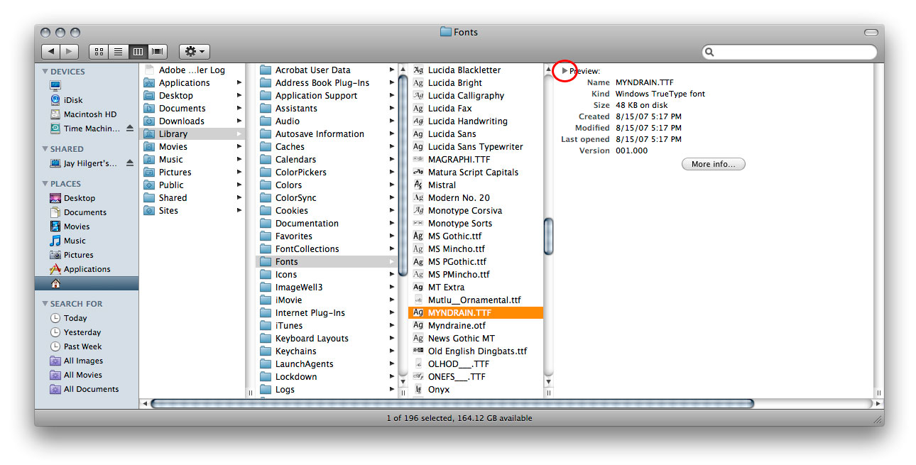
> What may need a bit more thought are the elements specific to this site,
> e.g. the browse by debtags functionality or the screenshots gallery.
>
> It would be great to know what you guys think.
>
> Here is a screenshot of what I have done so far:
> http://imgur.com/ZfQWU.png
>
> The launchpad project and code can be found here:
> https://launchpad.net/ubuntu-screenshots

How about one of these for the header?
http://www.foopics.com/showfull/f2a80d3cd8f3a1a388a2b0a53aaa96ac


Searching for a screenshot happens more often than adding one on that
site?

The empty top left is reserved for Latest_Uploads like active on
http://screenshots.ubuntu.com/ ?

I doubt everyone knows what a debtag is. Doesn't seem important, just
"Tag" or "Category" should do.

It bothers me that you can't middle-click a tag to open it in a new tab.

The list would be easier to scan if left aligned. The 2nd level
shouldn't have a different layout. Make it vertical, too.

It would be nice if changing to an entirely different page after
clicking a 2nd level tag could be avoided. It could be more like Apple
Finder's column view, even if that might make the space for thumbnails a
bit narrow.
http://www.bittbox.com/wp-content/uploads/2007/11/view_fonts_in_finder_4.jpg


--
Thorsten Wilms

thorwil's design for free software:
http://thorwil.wordpress.com/


--
ubuntu-art mailing list
ubuntu-art@lists.ubuntu.com
https://lists.ubuntu.com/mailman/listinfo/ubuntu-art