Hi,
We've been experimenting with the styling of the details element,
trying to figure out the most sensible way style it. We have tried to
find a solution that behaves the way authors expect, provides for easy
restyling by authors and avoiding the troubles associated with magic
styles that can't be expressed in CSS.
The rendering section of the spec is currently very inadequate and does
not describe accurate styles. Also, the sample XBL binding given in the
XBL 2.0 draft is also inadequate for a number of reasons.
== Requirements ==
In designing the solution, we have a number of requirements that we are
trying to meet as best we can.
1. The disclosure triangle must be styleable by authors, either to
replace with their own icon, remove it entirely, or possibly adjust
other common styles.
2. Styling the disclosure triangle should not require complicated hacks
with margins, padding or otherwise, to hide the default disclosure icon
and replace with a custom icon.
3. The default styles that apply directly to the details and summary
elements must be quite simple, such as display, margin and/or padding.
4. The styles applied to the elements in the shadow tree must not have
significant adverse effects on the details or summary elements, nor the
surrounding content. (We should avoid floating or other styles that may
give unexpected results in certain conditions.)
5. If authors change the 'display' style of either the details or
summary elements (e.g. inline, table-cell, etc.), the result should be
sensible, and not have any unexpected results caused by the styling of
the shadow tree. The binding template must not introduce extra
whitespace between elements that would affect the rendering in such cases.
6. We cannot require, nor expect, authors to use XBL to restyle these
elements. (We aren't actually implementing it with XBL, but we have been
discussing it in terms of XBL for future compatibility with it)
7. The content and styling of the shadow tree must not adversely affect
the use of ::before and ::after pseudo-elements applied to either
details or summary. (Note: Chromium's <details> implementation has some
strange handling for details::before, preferring to render it after the
summary instead of before.)
8. The special summary styling, including the placement of the
disclosure widget, should only apply to the first child summary element
of the details. Subsequent summary elements must not be rendered in
unexpected ways.
9. The default action of opening/closing the details should only apply
when the user clicks on either the summary text or the disclosure
triangle. It should not apply if the user clicks on the other content
within the details element.
10. The summary element must be focussable by default and keyboard
activation must be possible. The focus ring should be drawn around the
summary element and/or the disclosure triangle, and not the entire
details element.
11. The disclosure triangle and any applicable margins and padding must
render on the opposite side and point the opposite direction for RTL
languages.
12. It is preferred to reuse as much existing CSS styles as possible to
achieve the effects, avoiding unnecessary creation of special properties
or values without a good reason.
== Problems with the Spec ==

*Rendering*
There are a number of problems with the way in which the rendering
section describes how to render details [2].
When the details binding applies to a details element, the element is
expected to render as a 'block' box with its 'padding-left' property
set to '40px' for left-to-right elements (LTR-specific) and with its
'padding-right' property set to '40px' for right-to-left elements.
The first container is expected to contain at least one line box, and
that line box is expected to contain a disclosure widget (typically
a triangle), horizontally positioned within the left padding of the
details element.
According to these requirements, the details element should be rendered
something like this:
  +---+-------------------------+
  | > | Details                 |
  |   +-------------------------|
  |   | The content goes here   |
  +-----------------------------+
This is analogous to how it works for ul and ol. However, this creates
a substantial amount of padding on the left which authors are likely to
want to remove or otherwise significantly reduce in most cases.
An alternative approach is to apply a small amount of margin or padding
to the summary element alone, just enough to render the disclosure
triangle within, leaving the remaining content unindented. In this
case, a margin or padding of 1em would be a more reasonable size. 40px
is too much
  +---+-------------------------+
  | > | Details                 |
  +---+-------------------------|
  | The content goes here       |
  +-----------------------------+
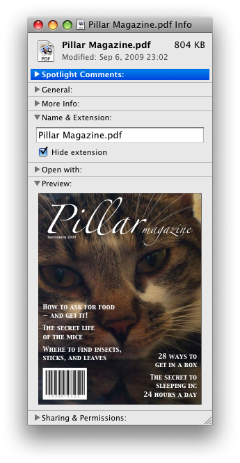
Note that Chromium's current implementation has an appearance visually
like this, and it more closely matches similar native mechanisms on
platforms that do not indent the content below the disclosure widget.
See, e.g. the screenshot of the Mac Info dialog from the spec.
http://images.whatwg.org/sample-details-2.png
We think that this latter style is a better default style to aim for and
would like to get feedback regarding this issue. In any case, it should
be trivial for authors to achieve either effect by adjusting the margin
and/or padding of the summary and details element.
*The Effect of the Shadow Tree*
The element's shadow tree is expected to take the element's first
child summary element, if any, and place it in a first 'block' box
container, and then take the element's remaining descendants, if any,
and place them in a second 'block' box container.
For reference, this maps to this sample binding from the XBL draft:

<template allow-selectors-through="true">
 ...
 <div>
  <div><content includes="summary:first-child">Details...</content></div>
  <div data-state="hidden" id="container"><content></content></div>
 </div>
</template>
The problem with this design is that it inserts new layout boxes into
the design that the author has no control over, which limits the
ability of authors to restyle summary and details. (This issue will be
discussed in more detail later)
The second container is expected to have its 'overflow' property set
to 'hidden'. When the details element does not have an open
attribute, this second container is expected to be removed from the
rendering.
Setting 'overflow: hidden;' will not have any effect on the second
container without there being a specified height. But it's not entirely
clear what the desired effect of that requirement is.
If the author specifies a height on the details element, then the
overflow should be handled by the 'overflow' property that is applied to
it by the author, rather than on any shadow content to which they have
no access. Setting 'overflow' to 'hidden' on the shadow content would
never actually cause anything to be hidden under any conditions.
*Activation Behaviour*
The spec does not clearly define activation behaviour. Ideally, the
default action of opening and closing should only occur when the user
clicks the summary element or the disclosure triangle. it should not
occur when clicking elsewhere.
In future implementations that support XBL, it should be possible for
authors to change the binding of the details element for layout
purposes, while still retaining the default action associated with the
summary element. Therefore, it seems unwise for this functionality to
be implemented via a binding, and would prefer instead that it be
specified as the summary element's activation behaviour.
It should also be possible for this default action to be cancelled with
evt.preventDefault() called within an event listener, which will allow
scripts or bindings to provide their own custom behaviour if desired.
== Problems Encountered While Developing a Solution ==
After many experiments with different styles and simulated bindings, we
encountered numerous problems that made it difficult to achieve the
desired outcome using bindings.
*Interfering Shadow Elements*
When the binding template used two block level elements to render the
content, like so:
<template>
  <div><content includes="summary:first-of-type">Details</content></div>
  <div id="content"><content></content></div>
</template>
This produced undesirable renderings in a number of cases where authors
specify the following styles:
details, summary { display: inline; }
The divs in the binding still render as block, causing this inline style
to have little apparent visual effect. At first we thought we could
address this by making those elements inline (using <span> instead), but
then we still found we ran into trouble with this case:
  details { display: table; }
  details>summary, details>div { display: table-cell; }

Assume this markup:

  <details>
    <summary>Summary</summary>
    <div>Content</div>
  </details>
Authors would expect the summary and div, as siblings, to render as
table cells side-by-side.
  +===========================+
  | ......................... |
  | : +---------+---------+ : |
  | : | Summary | Content | : |
  | : +---------+---------+ : |
  | :.......................: |
  +===========================+

  ... : Anonymous table row box
  === : Table box (details element)
  --- : Table cell boxes
Yet because of the block styled divs or inline styled spans in the
binding, this would instead result in separate anonymous table and
table-row boxes generated around each element, rendered inside the block
boxes. Thus, they would still be rendered one on top of the other
instead of side by side.
  +=================++=================+
  | ............... || ............... |
  | : +---------+ : || : +---------+ : |
  | : | Summary | : || : | Content | : |
  | : +---------+ : || : +---------+ : |
  | :.............: || :.............: |
  +=================++=================+

  === : Inline boxes from the binding (<span> elements)
  ... : Anonymous table and table row boxes
  --- : Table cell boxes
(I simplified the diagram to leave out the details element table box,
and the anonymous table-row and table-cell boxes that would be generated
around all of that)
This effectively makes two independent tables, rather than a single
table with two cells. Depending on the content or other styles, it
could, for example, result in the two cells unexpectedly having
different heights or wrapping around onto separate lines.
The result doesn't comply with requirements #4 or #5, and is thus
unsuitable for our needs. On its own, it would require authors to use
XBL to create their own binding with their own layout template in order
to effectively restyle the elements, which doesn't comply with
requirement #6.
We thus determined that we needed to find a solution that either gave
authors access to this shadow content from CSS, or which didn't generate
any additional layout boxes around the summary or content.
*Rendering the Disclosure Triangle*
Another problem was trying to find a suitable method that would allow us
to render the disclosure triangle without internal magic, leaving it
styleable by authors.
We want to avoid a situation like that with fieldset and legend, where
authors are severely limited in their ability to restyle the elements.
We also want to avoid an implementation like that in current Chromium
builds, where some internal magic has been used to insert the disclosure
triangle in a way that seems impossible to remove, and which breaks when
various styles are applied to details and/or summary.
The first approach we tried was to use the binding to insert a box into
the rendering, and allow it to be addressed by a pseudo-element.
Our first thought was to reuse ::marker from the CSS3 Lists draft, but
didn't think it was sensible to hijack that from list-item boxes for
this purpose. So we experimented with a different name instead.
  <binding id="summary">
    <template>
      <span pseudo="-o-disclosure"></span>
      <content>Details</content>
    </template>
  </binding>

This would be applied to the summary element.

  details>summary:first-of-type { binding: details.xml#summary; }
We would then use the 'content' property to insert a suitable character
glyph or image to render the disclosure triangle.
  details>summary::-o-disclosure {
    content: "▸"; /* U+25B8 BLACK RIGHT-POINTING SMALL TRIANGLE */
    margin-left: 1em;
    width: 1em;
  }
  details[open]>summary::-o-disclosure {
    content: "▾"; /* U+25BE BLACK DOWN-POINTING SMALL TRIANGLE */
  }
  summary { padding-left: 1em; }
The negative margin is used to push the disclosure widget to the outside
of the box and then compensate for that to prevent it going too far by
adding padding to the summary element. This had the effect of rendering
the disclosure triangle within the padding of the summary.
i.e. The resulting layout looked like this:

  +---+-------------------------+
  | ▸ | Details                 |
  +---+-------------------------|
This worked well in some cases, but we ran into troubles when other
pseudo-elements were used as well.
summary::before { content: "x"; }
Because of the way ::before is defined, it would still be inserted
before the ::-o-disclosure box, and due to the negative margin, the
disclosure triangle would render on top of it. This was unacceptable,
and so we needed to find a way to make sure the disclosure widget always
rendered before any ::before content.
One possibility would be to insert a new element into the binding after
the marker, like so:
  <template>
    <span pseudo="-o-disclosure"></span>
    <span pseudo="before"></span>
    <content>Details</content>
  </template>
But XBL as defined does not allow for the ::before pseduo-element to be
remapped like that.
We tried various other permutations of templates, moving elements around
in the binding to position the ::-o-disclosure box outside of the
summary box. Each presented its own set of layout problems under
certain circumstances.
For example, there were unexpected consequences when the summary element
wrapped around, causing the summary text to flow underneath the
disclosure triangle. Ideally, the rendering should look like this:
  ▸ This is a summary that wraps
    around onto multiple lines

But in some cases, the result looked this this:

  ▸ This is a summary that wraps
  around onto multiple lines
In extreme cases, it because possible for the disclosure triangle to
become unintentionally visually separated from the summary.
e.g. With this author style applied:

  summary { display: inline; }

The following could happen in some of our experiments.  Assume this markup:

  <div>line box with content before
    <details><summary>Summary wrapped to the next line</summary>
  </div>
The rendering could place the disclosure triangle in a separate line box
from the summary, which is undesirable.
  line box with content before. ▸
  Summary wrapped to the next line
Other experiments we tried resulted in other similarly unacceptable
renderings; used unreasonable amounts of CSS; or used fragile styles
like floats that could unexpectedly affect surrounding content, which we
really want to avoid. and so ultimately, we decided that we could not
use bindings effectively to insert such an element to render the
disclosure triangle, and we needed another solution.
*Hiding and Showing the Content*
Given that there is no explicit container around the content of details
excluding the summary, we still needed the binding to contain an element
that we could style with display:none; when in the closed state.
  <template allow-selectors-through="true">
    <style scoped>
      :bound-element:not([open]) #content { display: none; }
    </style>
    <content includes=":bound-element>summary:first-of-type"></content>
    <span id="content"><content></content></span>
  </template>
This method would effectively hide and show the content depending on the
state of the open attribute, exactly as specified. But then we still
ran into the trouble described above in the display:table-cell; case
described earlier.
While it was useful to have the element there in the closed
(display:none;) state, it became a nuisance in the open state. We
therefore needed to find a solution that would make the shadow element
disappear from the layout entirely when it wasn't needed in the open
state, yet still keep it around for the closed state, or to somehow make
it accessible to authors for styling.
== Proposed Solutions ==

*Rendering the Disclosure Triangle*
We eventually found that we could make use of display: list-item; and a
custom list-style to render the disclosure triangle beside the summary.
This approach has a number of advantages over the previous attempts we
tried using bindings.
* It allows us to take advantage of existing infrastructure
* It handles the ::before pseudo-element case correctly, which wasn't
  handled well with our previous experiments.
* It also gives authors a familiar and easy way to provide custom icons
  using 'list-style'.
* In the future, it should also give us the ::marker pseudo-element
  for free, if and when that gets implemented.
One limitation we discovered with this approach is that Opera currently
does not register click events when the user clicks on the bullet when
'list-style-position' is 'outside'. We prefer to keep this as 'outside'
rather than 'inside' so that the disclosure triangle is rendered in the
margin of the summary element.
We consider this to be a bug in our implementation, since the ::marker
should be considered to be a descendant of the element (just like
::before). Other implementations in Gecko and WebKit do register click
events, but they limit the clickable area to the small region where the
bullet is rendered. It may be better if the clickable area was made
larger so that it is easier for users to click.
To render this, the following CSS should be applied by the UA stylesheet.

  details {
    display: block;
  }

  details>summary:first-of-type {
    display: list-item;
margin-left: 1em; /* LTR-specific: use 'margin-right' for rtl
elements */
    list-style-type: -o-disclosure-closed;
  }

  details[open]>summary:first-of-type  {
    list-style-type: -o-disclosure-open;
  }

Variations:

* It is also possible for us to specify 40px padding on the details
  element as currently specified, rather than the 1em margin on the
  summary.

* As an alternative to defining new 'list-style-type' values, it is
  also possible that we could achieve the effects using
  'list-style-image'. i.e.

    list-style-image: url(disclosure-closed.svg);
    list-style-image: url(disclosure-open.svg);

  However, 'list-style-type' has some advantages
  to consider:

  - 'list-style-type' allows the disclosure icons to be handled like
    existing list bullets (disc, circle, etc.), making them available
    for use on lists too.
  - The colour of the list-style-type is inherited from the element,
    the 'list-style-image' is not.
I have created a simulated version with JavaScript to show the visual
layout of this approach. This demo uses 'list-style-image' and works
best in Opera or Firefox 4. WebKit does not support SVG images for
'list-style-image', and so it renders the default disc bullet instead.
It uses tabindex="0" to allow keyboard focussing. In Opera, the click
event fires when Enter is pressed while focussed, demonstrating keyboard
accessibility. In Opera, due to the aforementioned bug, clicking the
disclosure triangle won't work. Click the summary text instead, which
works in all browsers.
http://lachy.id.au/dev/2011/details.html


*Showing and Hiding the Content*
There are three possible solutions that we have considered to address
these issues.
1. Define a new special 'display' type that means the element generates
   no layout box itself, but still renders the content.

2. Dynamically change the binding to add and remove the shadow element
   as needed based on the open/closed state of the details element.

3. Define a new pseudo-element specifically for addressing the content
   area.


*New 'display' Type*
The proposal is to introduce a new special value for 'display' that
means to not generate any layout box for the element, but still render
its contents. i.e. Behave as if the element weren't there for layout
purposes.
For this, we came up with:

  display: transparent;
In theory, this would allow the binding to change the 'display' of the
the shadow element from 'none' in the closed state to 'transparent' in
the open state, thus hiding and showing the content as required.
  <template allow-selectors-through="true">
    <style scoped>
      #content { display: none; }
      :bound-element[open] #content { display: transparent; }
    </style>
    <content includes=":bound-element>summary:first-of-type"></content>
    <span id="content"><content></content></span>
  </template>

Advantages:
This is a very general purpose solution which I suspect will be useful
in many other bindings to solve similar problems.
Limitations:
A problem with this approach is that, depending on how existing CSS
layout implementations work, it may introduce some complexity or
implementation difficulties. In particular, our layout developers
expressed concern that there might be some internal implementation
complexities introduced by such a feature.
However, as this is an internal implementation issue, it's not clear if
such concerns would apply generally to all implementations, or if other
implementations wouldn't have any significant difficulty with it.
*Dynamically Changing the Binding*
The next approach we came up with is to apply separate bindings based on
the state of the details element. That is, have one binding for the
open state that rendered the content without any added elements in the
shadow tree, and another for the closed state that hid the remaining
content.
For this, we designed these bindings:

  <binding id="details-closed">
    <template allow-selectors-through="true">
<content
includes=":bound-element>summary:first-of-type"><summary>Details</summary></content>
      <span style="display:none;"><content></content></span>
    </template>
  </binding>

  <binding id="details-open">
    <template allow-selectors-through="true">
<content
includes=":bound-element>summary:first-of-type"><summary>Details</summary></content>
      <content></content>
    </template>
  </binding>
The first uses a span element in the shadow tree to hide the content,
the latter simply includes the content directly without any surrounding
span element.
The User Agent style sheet needed to apply these, including rendering
the disclosure triangle, looks like this:
  details {
    display: block;
    binding: url(details.xml#details-closed);
  }

  details[open] {
    binding: url(details.xml#details-open);
  }

  details>summary:first-of-type {
    display: list-item;
    margin-left: 1em; /* margin-right for RTL */
    list-style-type: -o-disclosure-closed;
    binding: url(details.xml#summary);
  }

  details[open]>summary:first-of-type  {
    list-style-type: -o-disclosure-open;
  }

(This CSS is the same as before, but with added bindings)
With this approach, given an implementation that does actually use XBL,
it would mean that the bindings would be attached and detached as the
state of the details changes.
To illustrate how this works, I'll show what the shadow tree should look
like when applied to a simple details/summary example:
  <details>
    <summary>Summary</summary>
    <p>Content</p>
  </details>

In the closed state, the shadow tree should look like this:

  details
  |
  +-- template
      |
      +-- content includes="summary"
      |   |
      |   +-- Summary
      |       |
      |       +-- Details
      |
      +-- span style="display:none;"
          |
          +-- content

This results in a final flattened tree that looks like this:

  details
  |
  +-- summary
  |
  +-- span style="display:none;"
      |
      +-- p


In the open state, the shadow tree should look like this:

  details
  |
  +-- template
      |
      +-- content includes="summary"
      |   |
      |   +-- Summary
      |       |
      |       +-- Details
      |
      +-- content

This results in a final flattened tree that looks like this:

  details
  |
  +-- summary
  |
  +-- p

Limitations:
This approach, however, may introduce some significant overhead as the
bindings are attached and detached. It also means that if an author
wishes to provide their own binding in a future XBL-supporting
implementation, they would have to override the binding for both states.
*New Pseudo-Elements*
The final solution is to introduce special new pseudo-elements
specifically for use with details that would surround the content,
excluding the summary. This could be represented in the binding as follows:
  <binding id="details-closed">
    <template allow-selectors-through="true">
<content
includes=":bound-element>summary:first-of-type"><summary>Details</summary></content>
      <span id="content" pseudo="-o-content"><content></content></span>
    </template>
  </binding>

UA styles could then be used to hide and show the content as needed

  details::-o-content {
    display: none;
  }
  details[open]::-o-content {
    display: block;
  }

Limitations:
This requires the creation of a new element-specific pseudo-element
specifically for use with details, which is not as nice as a more
general purpose solution that can be applied to other situations. It
also doesn't really address the problem directly, but instead merely
provides authors with a workaround.
== Open Issues ==
1. The summary should be focusable for keyboard navigation and
activation. This can't use tabindex in the binding, but rather should
be handled natively by the implementation like links or form controls.
For consistency, it needs to be possible to override if the author sets
<summary tabindex="-1">.
2. Should the default "Details" string change based on the user's
browser language, the page's language, or not change at all?
3. As stated earlier, we would like feedback regarding padding/margin issue.

[1] http://dev.w3.org/2006/xbl2/#simple-shadow-example
[2] http://whatwg.org/C#the-details-element-0
[3] http://images.whatwg.org/sample-details-2.png
[4] http://lachy.id.au/dev/2011/details.html

--
Lachlan Hunt - Opera Software
http://lachy.id.au/
http://www.opera.com/