On Thursday, 3 July 2014 at 11:40:34 UTC, Alix Pexton wrote:
I agree!
I started working on this little document last night while
angry and tired, maybe it should find its way to the wiki.
https://docs.google.com/document/d/1Sb4xnZUbzVRIicsfnxBFhTvRH4EOYq88wZexAuGcnaE/edit
Very nice; thank you. Though, having thought on it some more, I
would suggest the capital D and the two moons are the most
important aspect in terms of a distinctive mark.
The red background is currently an element of the logo design,
but I don't think it lends much potential for iconified forms.
Casting outward, I can't think of many logos that depend heavily
on their background either, and I think there are merits to
pursuing similar. Isolating the glyph and moons is pretty easy,
too!
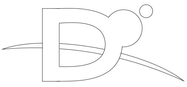
But this then calls attention to the implied horizon of Mars.
How essential is it to the mark? I'm really not sure, but my gut
is telling me it needs to be given consideration for at least the
more ornate levels of the design. So would emulating that
boundary with a thin crescent work? I don't have any good tools
on-hand, but I managed to scrape together this stupidly rough
wireframe that hopefully illustrates the basic idea well enough:
http://radiusic.com/imagedump/dwire2.png
This allows for dark-on-light or light-on-dark equally, with the
horizon some value in the red area; possibly a gradient.
-Wyatt