On 02/20/2011 03:53 AM, Nick Sabalausky wrote:
I've been updating the docs for my Goldie project in preparation of a new
release, and figured the they looked a bit...sterile, so I've tweaked the
CSS a bit. And, well, I think I've stumbled upon a heisencolor...(or a
heisenhue, rather)
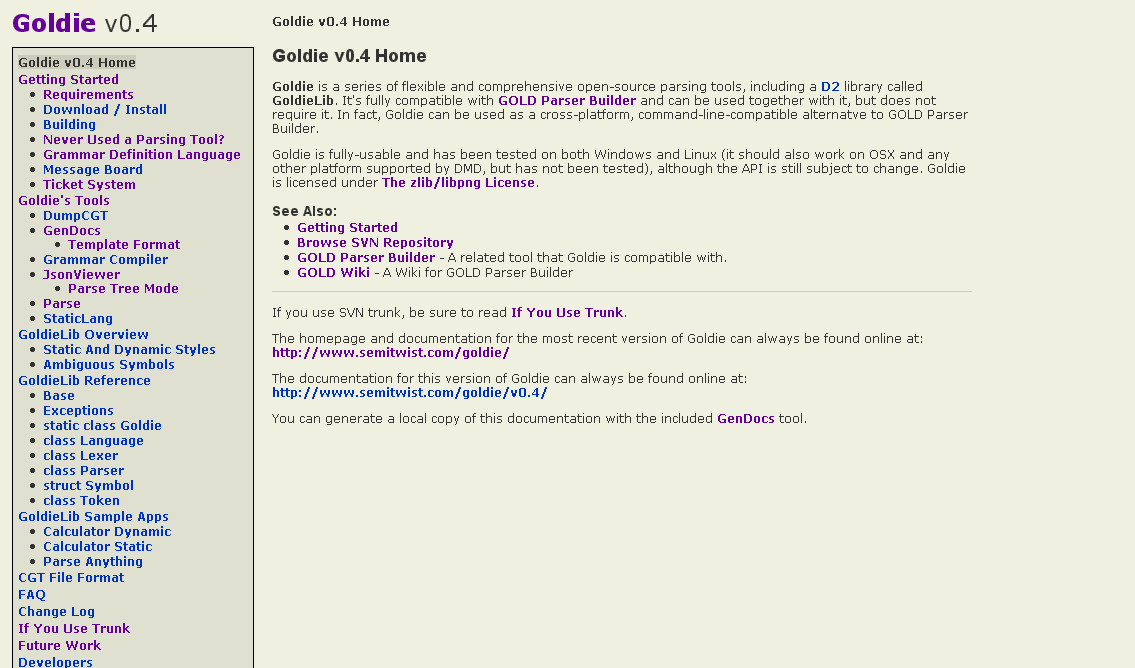
Without reading any replies or "cheating" by inspecting the pixels in a
paint program, take a look at this screenshot:

http://www.semitwist.com/download/goldie0.4docBeta.png

...and reply with what color you think the background looks like (the main
background, not the
sidebar). And whether or not you like it would be helpful, too, of course.
And, strange as this may sound, reply again if you end up changing your mind
on what color it looks like.

I don't think the weirdness is from my CRT monitor (yea, yea, it's a CRT,
"join the 21st century" etc...), because I've checked on someone's LCD and
noticed the same effect.

Secondarily, any other comments on the page would be appreciated, too. I'm
not much of an artist or graphic designer. This NG does seem to be a good
place to get many different opinions on a webpage's design. FWIW, I think I
may increase the font size slightly and darken the BG colors a tad.
I see it as a very light cold color (blue-green). But this may be due to my own
bg color (surrounding your pic) which is a very dark brown (thus, rather warm).
And yes, darkening it (more than a bit) would probably be a good idea (as said
by Jonathan, looks dirty). You can also give a hue to the fg colors; using the
same one as for the bg always fits; then, you can use a distinct (possibly
opposite) hue to set an alternate fg color, such as for frames, titles, whatever.
Denis
--
_________________
vita es estrany
spir.wikidot.com