Hey,
Hey, not a problem. There's the forum thread on this too.
Cool, I really thought again during the day to my morning email and
thought /" oh , maybe I shoudn't write critique just after testing ;
it's a bit a in-flame attitude that is not my way to do things"/ .
So I feel better for having your feedback.
Btw, thanks for your long mail and time , it's perfect to understand the
choice and limitations.
* The toolbar is the width it is purely so the brush preview can
display nicely. Try it with 24: everything looks very compressed and
icon text is unreadable. Suggestions welcome though; 32 is quite tall.
This brush preview is really nice and lovable at the actual size ; I
understand it's something this new GUI want's to preserve. So maybe it's
not a problem of this tall bar ; but more on the size of other icons.
I remember Jonnor did a branch by the past with a cool widget for brush
feedback on the top-right of the top bar ; it was also a nice place for
it , but with docking now on the right , the palette icons are more
logical in this place.
* Sometimes internal button and toolbar borders can bump it out a bit
too. Hacking on the runtime settings in gui/widgets.py seems to help
for specific cases.
ok
* Some people really like the top-left menu button, others hate it and
prefer a conventional menu bar. You get a choice.
Oh, I see. For the moment in Edit > preference > unhide menu doesn't
work yet. I'm not against this option and a configurable toolbar when I
can get rid of this button.
Personally I don't use a lot the menu on my everyday usage ; but I was
mainly affraid new users will not explore it because of this way all is
hidden. If you have good feedback,
I may be generating wrong analysis , because I mostly fine with
compacting menus this way ( I'm a chromium user :-P )
* Sliders are fiddly, look really ugly and inconsistent on toolbars
(in my experience; I've never been happy with the mockups I did), and
are best done in a dropdown panel.
I still have in mind my first innocent mockup when starting using
Mypaint 0.5 / 0.6 for sliders ...
http://david.revoy.free.fr/forums/Mypaint/mypaint-makeup-future-07.jpg
That's why my opinion may be is not 'fresh' but still related about this
old dream.
I tried Glade, and I begin slowly with tutorials ( it's a good tool ) ;
I could discover a widget called 'Scale slider' ( looking like that :
http://origin.arstechnica.com/reviews/os/gnome-2-20-review.media/gtk-volume.png
) who just pop on mouse over an icon ( or also a text entry box with
only written the value ) ; I find it very interresting ; because it can
maybe help to have fast tweaks for opacity and scale ;
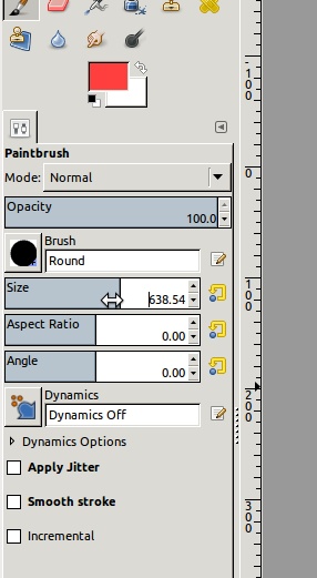
I'm a big user of the sliders tools at the bottom of the brush panel
widget. ( especially opacity and radius )
I also would ask if Gimp new shiny sliders (
http://www.gimpusers.com/system/tutorial_steps/2690/new_sliders-original.jpg
) are a common library with GTK and PyGTK because they looks good for
this kind of usage ( better than traditional sliders ) . But maybe they
are Gimp specific and can't be 'stolen'
* You don't get the full brush editor on the Brush Settings dropdown
because space is limited, and presenting the full editor would be
massively overwhelming. It should be simple and pretty, and quick to
understand, and I made a choice about which sliders to show -
hopefully a good one.
Ok, that's good, and my point wasn't really good about it. I thought
about it, and I really reconsidered my point of view about it ; full
brush setting is not a placement for that , for sure.
Btw , I would also see on the type of sliders there, angle and aspect
ratio of the brush. ( for artist using knife tools , to control angle )
I like the slow tracking addition ; useful for artist who do line art
and need lines smoothing.
* Actually, you  sort of -do- get the full editor in the dropdown.
It's just on a button :)
Yep, a advanced brush editor button is nice. Thanks to did it.
* I use quite a big font here because I use a hi-res screen and don't
like squinting. That may be making the menu button's label look
better-spaced on my screen than yours, and that maay be skewing my
judgement on this. Willing to compromise on toolbar width if I get
good suggestions about preview stuff up there.
This menu button label can be decorated with the Mypaint Icon ? that
could looks like a 'start' button of O.S. ; something friendly.
* Can't vouch for the Faenza set, but yeah. I use it myself, and that
size looks *ugly*. See above about the 32px setting. Suggest how I
could cram a 256px brush preview into 24px (preview-on-hover or
tooltip is one idea, give me mockups, raise bug reports! :))
Yes I have to think about it ; with Glade I saw you have to deal with a
kind of splitted frames ordered like table to enter button and icons ;
it's really not simple.
* I want the quick brush selector to appear in the brush chooser
dropdown alongside the history. Watch this space :)
Cool !
* Same thing for the colour menu, though initially you may get a
colour triangle and the history.
Oh good ; about colors ; a GUI things I would like is to have the HSV
bar color selector as a separated widget in Mypaint.
I like it , but because it is attached to the square color selector , I
never use it.
* Blend modes are just too obscure a feature to have visible
initially. I'd rather new users just choose a specialised eraser brush
for erasing out, and ignore Lock Alpha completely unless they choose
to experiment. However I'm designing the toolbar XML with UI merging
in mind. Options may be available later on:
https://gna.org/bugs/index.php?18606
Good ; to switch between future Blending mode easily is somehting I
would really like. But of course no blending mode yet, so ; this is not
an actual question.
* Really glad you like the change of icon when the brush settings
change from the presets :) It's an ugly orange asterisk because I may
be overlaying it on top of the history icons at some point if *they*
have changed from their presets. Other suggestions welcome :)
I like a lot of thing in this new UI ; thanks for the big job.
It's really about little things finally my first critiques was about.
* Save button in the brush settings is definitely a nice touch! Save
back to (the user copy of) the parent brush, presumably? If we do
this, any revamp of the brush editor dialog should use similar-looking
UI.
Thanks to agree on it ; here I often change Radius of my preset then
save it depending the artwork size.
Hitting each time Ctrl+B and find the right icon was really hard ( with
my Faenza theme, the icons in Brush editors are a bit abstract )
A shortcut like this is really welcome :)
I agree Brush editor dialog should have on the top 'name label' instead
of icons
( save settings / Add as New / Edit brush Icon / Rename / Remove )
I also propose myself for doing a more cleans series mockups ( photomontage
of screenshot ) to show what would rocks imho with the actual element ( no
new features , just littles GUI tweaks here and there ).
Also, this mockup could be shown to other artist to discuss and be surely
less work for me to change them , than to change it in code
( like webdesign process, I guess ).
Yes yes yes! Mockups are always welcome, though we may not implement
everything. You may want to play around with the Glade user interface
designer to see what's available with standard widgets[1] - we don't
use GtkBuilder or libglade UI definition files within mypaint, but if
you make something nice, I can lift the details of spacing and layout
etc. from the mockups you make if you share the file.

BTW, I'm considering
http://developer.gnome.org/hig-book/3.0/design-window.html.en and the
spacing guidelines within it as a general standard. In fact the entire
HIG book is quite reasonable as a standard approach (I use the Tango
icon guidelines and palette when I'm making tool icons though - to my
limited degree of skill :)

[1] much quicker for us to implement :)
Thanks for the ressources, be sure I will study them carrefuly ; I
already started with Glade, and it's perfect to see the 'vocabulary' of
GTK widget.
My first mockup proposition would looks like this :
http://david.revoy.free.fr/forums/Mypaint/2011-09-06_screenshot-mockup.jpg
( not perfect, but just to express ideas ).

Again thanks for your time reading and writing and coding;
now, I will let other express theirself on this subject and will study
your links and comeback to the work I started on Mypaint website :)
+

-David
____________________________
http://www.davidrevoy.com
_______________________________________________
Mypaint-discuss mailing list
[email protected]
https://mail.gna.org/listinfo/mypaint-discuss