Hi guys,

Here's a mid-year follow-up to the node density visualization.
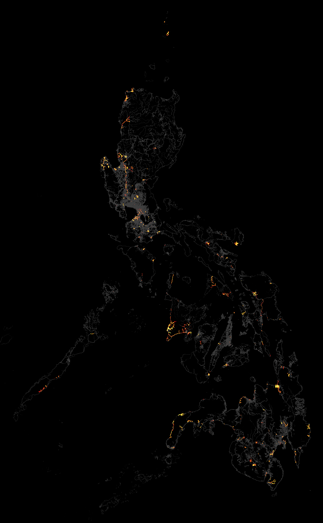
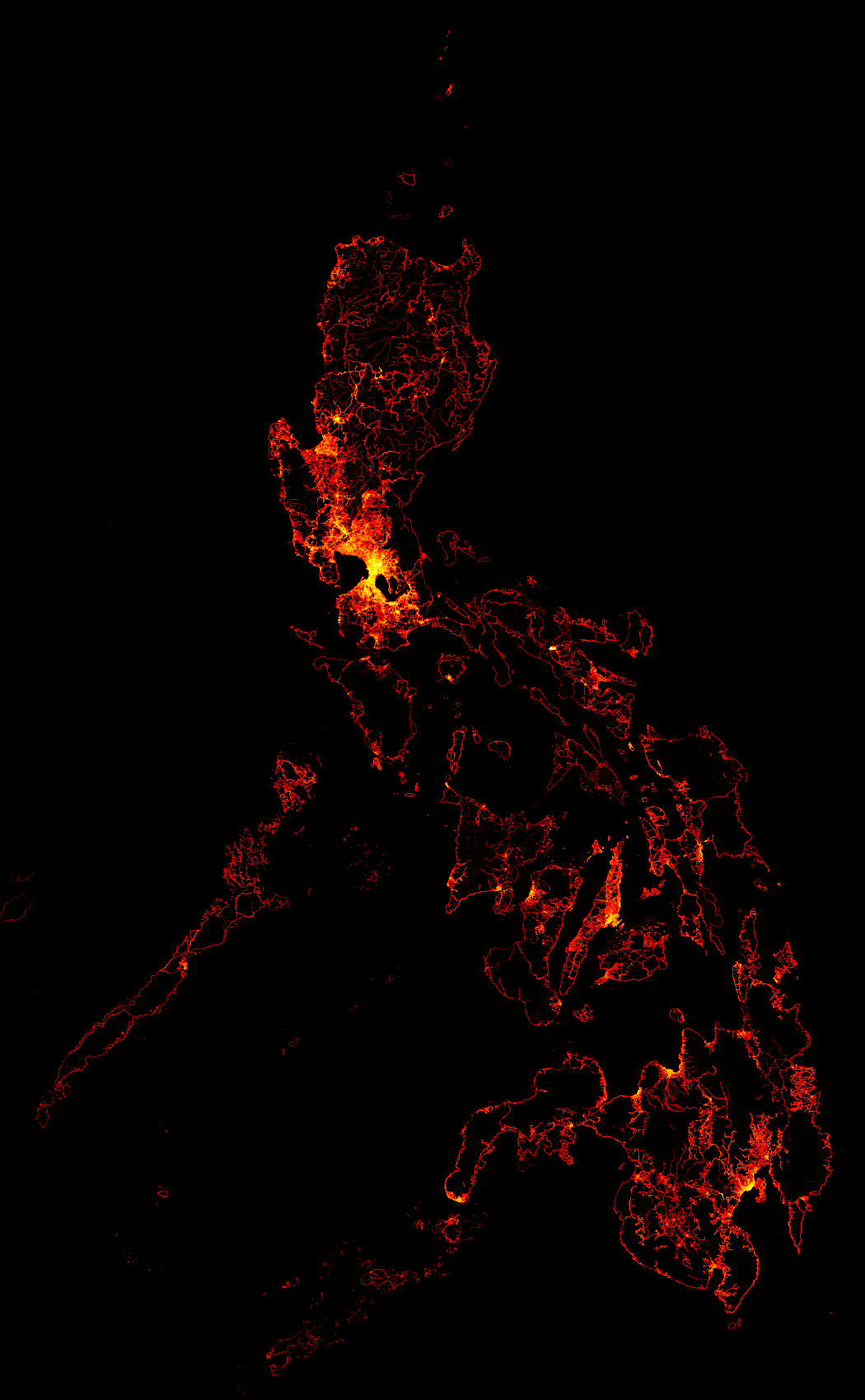
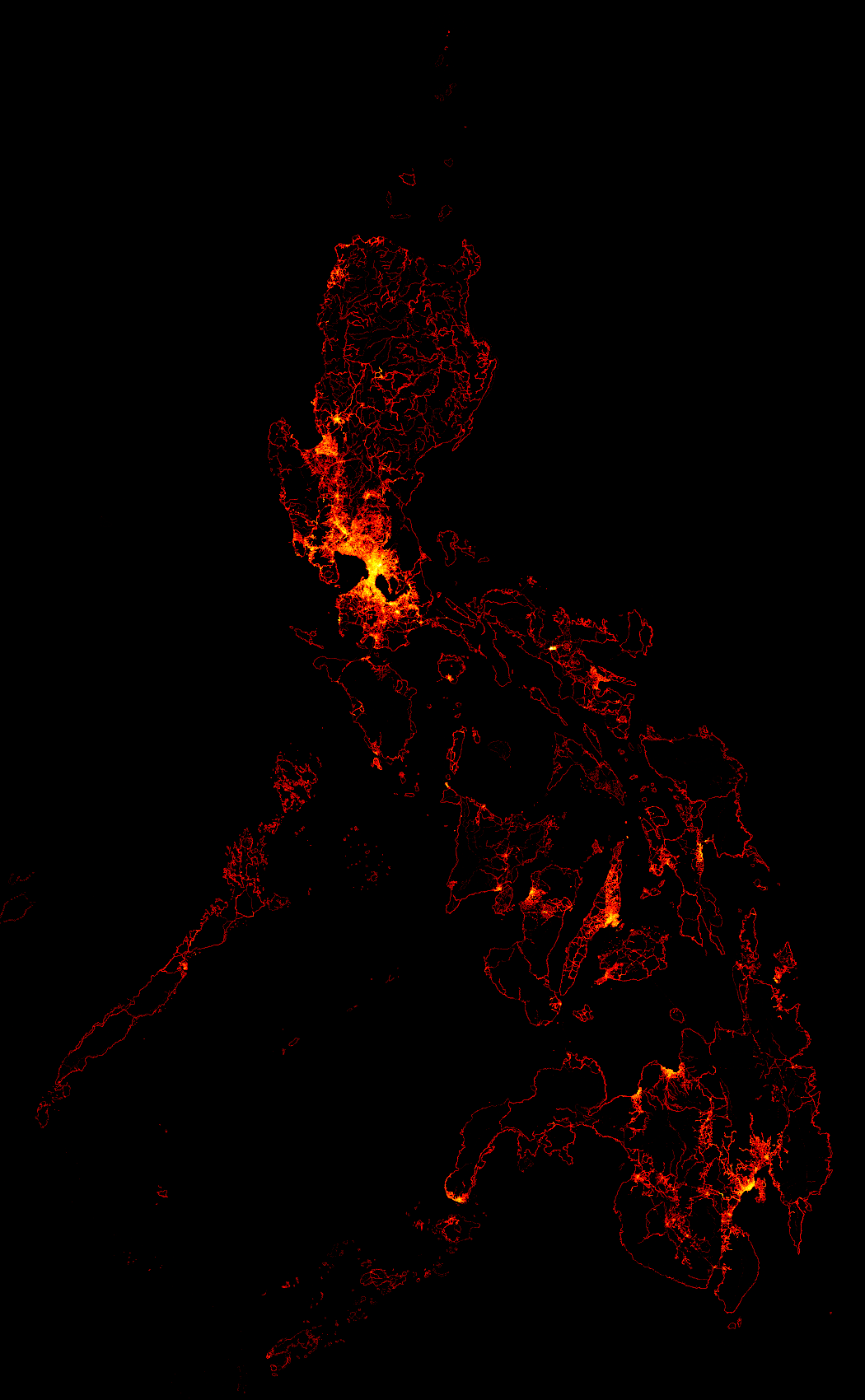
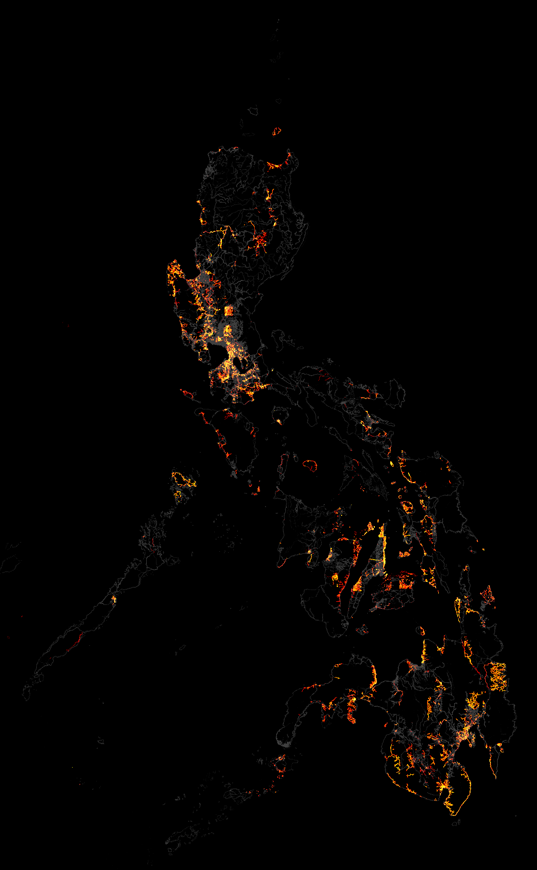
Here's the density increase from the last time (June 3) to July 1:
http://wiki.openstreetmap.org/w/images/5/52/Philippines_node_density_increase_from_2012-06-03_to_2012-07-01.png

The new Bing imagery in June has resulted in increased data in
Catanduanes, Metro Naga, Antique, Dumaguete, Butuan, and Tagbilaran.
The new Orbview-3 imagery on the other hand resulted in increased data
in Palawan, Romblon, and Antique.


Here's the density increase from the start of the year to July 1:
http://wiki.openstreetmap.org/w/images/5/56/Philippines_node_density_increase_from_2012-01-02_to_2012-07-01.png

And here's the node density map itself as of July 1:
http://wiki.openstreetmap.org/w/images/8/80/Philippines_node_density_2012-07-01.png

Compare to the one from the start of the year:
http://wiki.openstreetmap.org/w/images/8/81/Philippines_node_density_2012-01-02.png

Eugene


On Sun, Jun 3, 2012 at 4:43 PM, Eugene Alvin Villar <sea...@gmail.com> wrote:
> Hi guys,
>
> I made a follow-up to the node density visualization I shared back in
> March. This time, the map shows the node increase compared to the data
> of the original map. Similar to before, brighter pixels represent
> areas with higher node count increases. Gray pixels show the original
> data as a baseline.
>
> You can view it here:
> http://wiki.openstreetmap.org/w/images/5/56/Philippines_node_density_increase_from_2012-01-02_to_2012-06-03.png
>
> For comparison here's the original map:
> http://wiki.openstreetmap.org/w/images/8/81/Philippines_node_density_2012-01-02.png
>
> Take note that this is not a map of editing activity! It only merely
> shows node density increases. (So if someone deleted a node in an area
> and another one created a node, there will be no change in the node
> counts.) But this visualization does somewhat indicate where new data
> is being added.
>
> It's nice to see that most parts of the Philippines have seen an
> increase in data. You can see the obvious effect of the new Bing
> imagery that was released back in February as bright rectangular
> areas.
>
> Nice work everyone! Let's keep it up! :-)
>
> Eugene
>
>
> On Sat, Feb 25, 2012 at 8:38 PM, Eugene Alvin Villar <sea...@gmail.com> wrote:
>> Correction, that should be 0.01°, not 0.1°. :-)
>>
>> On 2/25/12, Eugene Alvin Villar <sea...@gmail.com> wrote:
>>> Hi guys,
>>>
>>> I created a visualization showing the node density of OSM data in the
>>> Philippines taken from the 2012-01-02 Geofabrik extract. Each pixel
>>> represents a 0.1°×0.1° degree square or approximately 1 square
>>> kilometer. Brighter pixels represent areas with higher node counts.
>>>
>>> View it here:
>>> http://wiki.openstreetmap.org/w/images/8/81/Philippines_node_density_2012-01-02.png
>>>
>>> The edges of available satellite imagery at that time is quite visible
>>> in some areas like Pangasinan, Cebu, Bukidnon, and Davao del Sur. As
>>> expected, brighter areas are places where there is a large amount of
>>> editing and with a large population.
>>>
>>> By the way, can you guess which place has the densest concentration of
>>> nodes (the only purely white pixel in the image)? It's in Naga City
>>> and this is due to the Naga City import. The second densest location
>>> is in Marikina, and this is thanks to maning's efforts in mapping all
>>> of the buildings in his adopted city. :-)
>>>
>>> Eugene


--
http://vaes9.codedgraphic.com

_______________________________________________
talk-ph mailing list
talk-ph@openstreetmap.org
http://lists.openstreetmap.org/listinfo/talk-ph