Étienne Bersac wrote:
Hello,
Thank you Mark for responding, don't forget you are our bdfl :)
I like the glass effect on our current widgets.
I also like the glassy effect. Something i dislike is the
inconsistence of glassiness between widgets. What about glassy
buttons, combo and scrollbars ? That might make the theme more
consistent. Check and Radio button aren't glassy enough to fit well
with the progress bar. Is this possible to glass tongoish icons ? A
kind of mix between tango colors and ubuntu glassy might be a great
compromise.
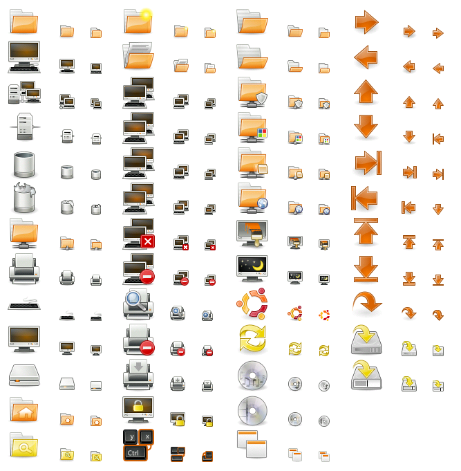
In tangerine [1] the folder icons have been glossed up a tiny bit
compared to tango-icon-theme, but making the whole set out of glass
would not be that great, as you have to stare at these interface
elements all day.
As Mark said, glossy stuff should be used with care.

1. special theme based on tango-icon-theme but with more brown and orange
http://xoomer.virgilio.it/bat/orango-tango/status.png

--
ubuntu-art mailing list
ubuntu-art@lists.ubuntu.com
https://lists.ubuntu.com/mailman/listinfo/ubuntu-art