Argh, again to the wrong address. I wonder if thats a bug thunderbird :/
-------- Original Message --------
Subject:        Re: Fwd: Re: Eventually drop the top-panel?
Date:   Wed, 29 Jun 2011 20:32:08 +0200
From:   Kai Mast <kai.m...@freakybytes.org>
To:     Matthew Paul Thomas <m...@canonical.com>


On 29.06.2011 11:37, Matthew Paul Thomas wrote:
Kai Mast wrote on 27/06/11 22:50:
>...
>  On 27.06.2011 11:39, Matthew Paul Thomas wrote:
>>
>>>  This would mean that we could drop all the "maximize to panel" and
>>>  globalmenu-patches.
>>
>>  I don't know what you mean by "maximize to panel". As for the global
>>  menu, patches for that are heading upstream for Firefox, Thunderbird,
>>  and LibreOffice 3.4.
>
>  I don't mean the global menu but the way the maximized window and the
>  top-panel get merged. Imo this is a sign that the top-panel has no use
>  anymore..
I don't understand that logic at all.
Merging the title bar of the window and the top-panel means that the
top-panel is in the way of the window, and that without the indicators
you wouldn't need it at all...
>>>                        Functionality like the sound menu could also be
>>>    included into the jumplist of the dash...
>>>...
>>  That would mean things like the time, volume, and battery status
>>  would be invisible much of the time, and would take up much of the
>>  launcher when they were visible. It would be the worst of both
>>  worlds.
>
>  With sound menu I meant the way you can control you music player via
>  indicators. It would be way more straightforward if one could control
>  the music player via a jumplist (=right-click-menu).
It would be much less straightforward, for three reasons. First, the
launcher is visible much less often than the launcher is. Second, even
when it is visible, launcher items are sometimes folded off the bottom
of the launcher, while nothing like that ever happens to the sound menu.
And third, a quicklist is accessible only if the music player is running
or is one of your favorites, whereas the sound menu is accessible all
the time.
Why do you need to control the music player if it isn't running at all?
It's pretty easy to show the launcher just by moving to the edge of the
screen, so I don't see where the problem is here. Somebody already
suggested that we could only partially hide the launcher, which I think
is a great idea. The hidden launcher is also very diffcult to understand
as a casual user. Just read one of the reviews of unity and it will say
exactly the same...
>  Well, you're right some indicators are still needed like the battery
>  or network indicator, but this doesn't justify a whole top panel in my
>  opinion.
That's possibly true. Phone OSes typically use a whole top panel just
for indicators, but they have much less width to work with.

But it's also irrelevant, because in Ubuntu the menu bar is not used
just for indicators, it is also used for window menus. That would be a
good thing even if there were no indicator menus at all.
I still think that the global menus aren't a good solution. Especially
the way they're hidden right now. It's very difficult for a newbie to
find out that you have to hover the top-panel to get to the window menu..
By removing the top-panel we would of course need to move the window
menus back to the windows..
> We could move the indicator area into the dash
That would be even worse than moving it into the launcher.
Sorry I meant the launcher..always confuse those too. The indicator area
could be located where the thrash icon is at the moment. Just like you
have on windows 7 when the panel is on the side of the screen.
Look at this screenshot for example: http://bayimg.com/KAIDkaAdO
> or even better
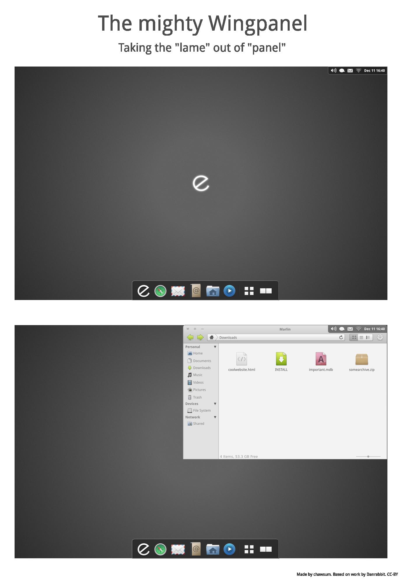
> use something like the once proposed wingpanel:
> http://cdn.omgubuntu.co.uk/wp-content/uploads/2010/12/sipzz.jpg
The wingpanel is mostly a false economy. It relies on you having
something useful to do with the left ~70% -- but not the right ~30% --
of the top row of the screen, which is unlikely.
You don't need the right part of the screen because the titlebars are
layed out in a way that this area is always unused. At least in the
default Ubuntu theme...
>  My problem with the current situation is that a lot of functionality
>  is duplicated. Empathy for example indicates new messages on the dash
>  and also in the messaging-indicator...
>...
As far as I know, Empathy does not indicate new messages anywhere in the
Dash. It is true that it uses both the launcher and the messaging menu,
and that this is duplication. But the messaging menu aggregates new
messages from multiple applications, and it's not at all obvious how
this could be done in the launcher. Either new Empathy messages would be
shown only in a launcher item that*wasn't*  the Empathy one, which would
be bizarre; or they would be shown in both the Empathy launcher item and
the aggregated launcher item, making the duplication much more jarring
than it is with the messaging menu.
Sorry, of course I meant the launcher. Why would it be more confusing if
I had a message count next to the application instead of the messaging menu?
--
Ubuntu-devel-discuss mailing list
Ubuntu-devel-discuss@lists.ubuntu.com
Modify settings or unsubscribe at:
https://lists.ubuntu.com/mailman/listinfo/ubuntu-devel-discuss