On Tue, Jun 22, 2010 at 14:32, Denis Gervalle <d...@softec.lu> wrote:
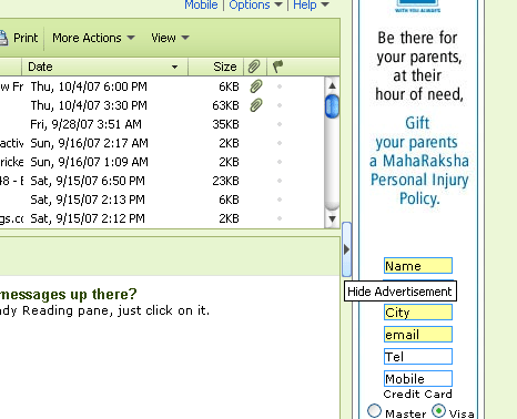
> Hi Caty,
>
> I really apologize in advance for looking at this so late and also for my
> upcoming comments.... do not feel hurt please, but I do not feel that this
> interface will provide the nice export functionality we expect.
>
> First, here is a resume of my main remarks:
>
>  - You need a big, large screen to see it properly, and at the same time,
> everything is small and concentrate.
>  - There are too many choices at the same time, and this cause a real
> excess
> of complexity
>  - Navigation in the list of document, and filtering, are absolutely
> different to what the user is accustomed to with LiveTable
>  - Scalability issue increase the complexity in the document list,
> and choice of export format will not scale easily
>  - Some export options (in the format box) change the list of document that
> will be exported after your initial choice
>
> Let me now review this in more details.
>
> 1) Screen size and complexity
>
> Putting together the 3 parts of this interface (full list, selected list
> and
> export options) make it complex and cluttered.
> IMO, there isn't several way to solve this. Each part should be in a
> separate screen. This will both decrease complexity, and allow more
> flexibility for composing each screen.

These screens could than be linked
> together in a wizard like interface (Back/Next), and a direct access could
> also be provided using tabs or similar control. These tabs should also show
> the normal path of actions.
>

I don't agree having separate screens. The pattern for this case is
Collected Selection: when you want to collect items in one place from
multiple pages / sources / searches. You should be able to change your mind
(delete, reselect) about a selected page, without the need to go back and
forth across wizard pages. Also you can't see all the already selected pages
in the "Select documents for export" (search), because you can always change
that view state (make another search, go into tree view, etc). So separate
screens would be disturbing my flow, relying on my memory in order to know
what I've selected.

So "Select documents for export" and "Selected Pages / Package Content" need
to stay together, in order for the actions (select/remove) to be natural and
the user to feel in control about his selection.

The user can have more paths of completion:
1) (A) Search/Browse/Select pages -> (B) See/Manage selected/saved pages ->
(C) Adjust Export Options -> (D) Export
2)                                                     (B) See/Manage saved
pages              ->  (C) Adjust Export Options -> (D) Export
3)                                                     (B) See/Manage saved
pages              ->                                        -> (D) Export
(rely on defaults)

Export Options should be placed somewhere near the "Selected Pages", because
they are part of the export process, but it's not mandatory to be on the
same level.

So the process is something like (A) - (B) ; (B) - (C).

Idea (nr.1) Now, when you resize the prototype is trying to fit and has
relatives width, but we could do something like:
http://incubator.myxwiki.org/xwiki/bin/download/Improvements/MultiExport2Proposal/resizing.png
The options could float on the next level. In the case we have lots of pages
we want to export, we need to provide a shortcut top link to options.

Another idea (nr.2) would be to have something like an vertical accordion
that could expand/collapse elements that we don't need anymore.
Something like "Hide Advertisement"
http://www.nirmaltv.com/wp-content/uploads/2007/10/ads.gif done for
hiding/showing search part "Select document for export" or done for "Export
Option".

Idea nr.3 would be to have just "Select documents for export" + "Selected
Pages" and when you press on "Export", it will happen something like when
you press on "Annotation". An overlay would appear where you can select what
options you want to have.
http://www.xwiki.org/xwiki/bin/download/Main/ReleaseNotesXWikiEnterprise23M1/ShowAnnotation.png
The options could partially hide the Selected Pages, because the user
doesn't need them anymore, since he is in the final step (he already decided
what he wants to export).

I think nr.3 is my favorite option, since you wouldn't have to scroll to get
to options, options are not mandatory for the search/select process, but
would make a great difference to have them in context (on the same page,
without changing the view, reloading the page).

If more agree on nr.3 I could make a mockup to see how it looks.


> 2) List of documents and scalability
>
> IMO, we should inspire the list of document from the livetable (not the
> tree) actually in AllDocs. We need to have it improved (also in AllDocs),
> but keeping the same look and feel between both of them will obviously
> helps
> both users and developers. The livetable in AllDocs already solve the
> scalability problem nicely, and users will be accustomed to it.
>

Maybe it's just me, but I don't want that every control in XWiki to be a
livetable. When I first started thinking about the Selective Export, the
main idea was to have something very similar to the current Importer.
http://www.xwiki.org/xwiki/bin/download/Main/ReleaseNotesXWikiEnterprise22/import.png
http://incubator.myxwiki.org/xwiki/bin/download/Improvements/MultiExport2Proposal/8.png

And they should be similar because they are dual actions: export / import.
Also the tree view for XAR files is optimal IMO.


>
> What should be improved (in both place) ?
>  - Allow filters on document contents or using the tagcloud. This will
> provide a mix with the search feature and the tag feature, but in a filter
> way (without sorting by relevance)
>  - Allow customizing columns, since we might want to choose document based
> on creation date, modification date, authors, creators, presence of
> attachements, ... and not all of them could be proposed at once
>  - Allow displaying hidden documents
>  - Allow small popup document preview ?
>

if the names are links we don't need the preview


> What should be added for export ?
>  - A display of the selection status, probably near the name, on the left.
>  - To allow user to select whole Space, why not list them in there own row,
> next to the documents, and provide a "type" filter to list only spaces,
> document or both. For spaces, the selection box could be three states,
> showing partially selected space.
>  - "Add/remove all displayed item", "add/remove the whole filtered list",
> should be proposed for easy large selection/deselection. An undo option
> could be nice to have.
>

This UI version is doable, but I don't know if this is really the direction
we want to take. More opinions would help. The selection would look
something like Gmail or Yahoo.


>
> 3) List of selected documents / Spaces
>
> To stay simple, this list should be very similar to the previous one (and
> influenced by the column customarily displayed in the previous step by the
> user). This is in fact a filtered view on the selection status.
> I would not mix it with the previous one, to provide a clear step by step
> way and a slightly different interface :
>  - The selection status should be replace by a removal button.
>  - Some external button should allow:
>  - "Add Children" which will add one level of children of all selected page
> to the list
>  - "Add All Children" which will add all children of selected page
> recursively to the list
>  - "Add Linked Pages" which will add pages linked from currently selected
> page to the list
>  - "Add All Linked Page" which will add pages linked from currently
> selected page recursively to the list
>  - "Undo last addition" using one of the previous buttons which will return
> the list to its previous state
>  - "Save current selection" which will allow saving the current selection
> for later use/reuse
>
> If the export contains unselected children pages, or unselected linked
> pages. It may be useful to warn the user of that situation on this screen.
>
> 4) Export options
>
> This last screen should allow the selection of the export format from a
> free
> list. After a deep refactoring, we should be able to easily implement new
> export format (using components) and this list of format should be
> dynamic. Obviously, the format options will be displayed depending of
> the chosen format (including custom interface by custom formats).
> But, these options should not change the list of exported pages in any way,
> this is confusing.
>

If we get more space for displaying Export Options, then I don't see any
problem in having tabs for showing options. This scales.


>
> 5) What about the hierarchical views
>
> IMO, we should stay away from them as much as we can since trees of large
> sets have a serious scalability issue (I means for the user, not only the
> computer). I have already provide some hints on how to provide children and
> link inclusion, but may be we can go one step further with reasonable
> complexity.
>
> For each rows of both table describe above, we may have several expanding
> box (a "small" lightbox), that shows:
>  - the list of direct children of the page/space
>  - the list of all children of the page taken recursively
>  - the list of linked page from the page
>  - the list of all linked page from the page taken recursively
> These boxes will display a similar list to the current one (without further
> expanding boxes), allowing review/selection of additional pages
>
>
IMO trees are very good at reflecting hierarchy (space/page and
parent/child). And this is the way users are organizing and browsing (also
in WYSIWYG) their content inside XWiki, by using the breadcrumbs and by
mentioning always the space (page creation, copy, searching).

The reason I added the List View was to accomodate work already done for
MultiPageExport application
http://code.xwiki.org/xwiki/bin/view/Applications/MultiPageExportApplication

How much from what is in MultiPageExport application can be reused for the
"livetable" version?

Also, the first version of Selective Export proposal received nice feedback.
So I'm not sure we should rethink this UI. WDYT? Any other opinions?

Thanks,
Caty


> Well, there is probably many adjustment that could be needed on the way to
> this interface, and I hope my remarks will be the source of inspiration for
> an even better solution.
> Thanks to those who have read me, this is a little bit long... I know.
>
> Denis
>
> On Mon, Jun 21, 2010 at 21:55, Ecaterina Valica <vali...@gmail.com> wrote:
>
> > Hi,
> >
> > I've made Selective Export Proposal 2 (HTML + CSS)
> >
> >
> http://incubator.myxwiki.org/xwiki/bin/view/Improvements/MultiExport2Proposal
> >
> > This proposal follows more closely existing features from MultiPageExport
> > application, like:
> > + Search by title/name/space/tags
> > + Ordering in the export list (important for HTML and PDF)
> >
> > *Improvements* from Proposal 1 (
> >
> >
> http://incubator.myxwiki.org/xwiki/bin/view/Improvements/MultiExportProposal
> > ):
> >
> > - separation of "Saved Packages" in another top tab
> > - Added: "▾more ( 18 / 56 results )" when more pages/spaces are displayed
> > - Added: "reset to defaults" to export options values
> > - Combined "Package Content" and "Export Options" under "Export documents
> > as
> > package"
> > - Changed "Export" button position to top
> > - Added deletion for saved packages + saving date
> >
> > Also, this proposal has 3 modes for pages relationship visualization:
> > Space/Page Tree, Parent/Child Tree, List View
> >
> > Currently MultiPageExport application and XWiki WYSIWYG Search feature
> uses
> > "List View" (page title + location) mode to display information. This
> > should
> > be the default mode to display information: less cryptic, with search you
> > could find information that you don't know the location. Also the
> ordering
> > (moveUp/moveDown) is more natural for HTML/PDF/RTF export, because
> entries
> > are independent.
> >
> >
> http://localhost:8080/xwiki/bin/download/Improvements/MultiExport2Proposal/3.png
> >
> > IMO, for export applications (XAR) "List View" is less usable and the the
> > perfect candidate is "Space/Page Tree" view.
> >
> >
> http://localhost:8080/xwiki/bin/download/Improvements/MultiExport2Proposal/8.png
> >
> > Advanced users that will need "Space/Page Tree" or "Parent/Child Tree"
> will
> > have to manually changed the display view and/or the export options, the
> > others will relay on defaults.
> >
>
_______________________________________________
users mailing list
users@xwiki.org
http://lists.xwiki.org/mailman/listinfo/users