I think the analysis of the curve shapes is gross over-interpretation.
First of all, it's not clear from the paper that the square wave at the
input really represents a measurement, or an artist's conception. As far as
I understand, it's taken from the video, but all they really say is what
the peak value is, and what the cycle timing is. They don't say it drops to
zero between the peaks, and they don't say how rapidly the change is. I got
the impression that they just drew a square waving using the measured cycle
times and the peak voltage.
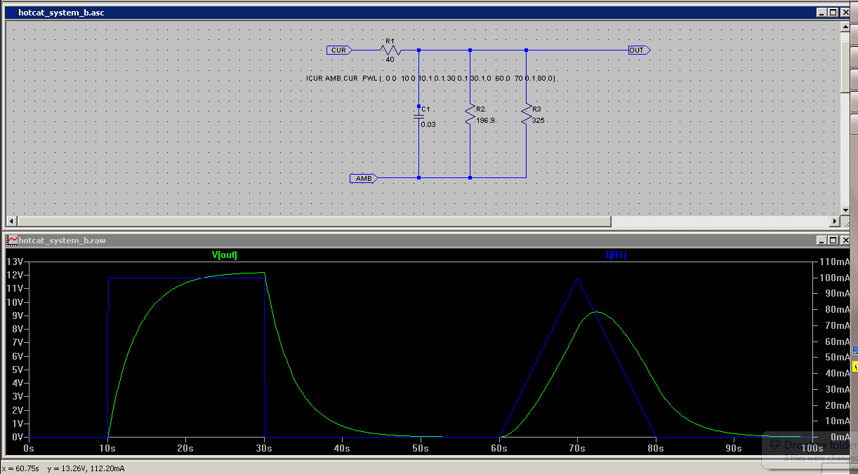
Second, we don't know what other loads may be in the circuit inside the
box, since there is no measurement on the output of the box.

The observed cycling of the temperature is entirely consistent with a
cycling on the input to the ecat between two levels very far from zero, and
therefore representing much higher input power than claimed. And the cheese
video shows how easy it would be to fool the meters into showing zero input
during part of the cycle. It doesn't mean they used the same method, only
that meters are not difficult to trick. Since it's clear the wiring was set
up by Rossi, since it was already running when they came in, there is no
transparency here at all. The blank run used a different power regimen.
What's the use of that? It's a first class farce. Nothing more.


On Tue, May 28, 2013 at 2:12 PM, Alan Fletcher <a...@well.com> wrote:

> http://lenr.qumbu.com/130528_waveform_04.png
>
> The strange shape results because the eCat's heat is not a square-wave
> response: it's triangular.
>
> The actual shape is probably a superposition of the square-wave (resistor
> heating) and triangular (ecat).
>
> (My curve shows what happens when the on/off cycle is too slow.)
>
>