Solid design and agree with all your comments aldrin.   Very nice
On Jan 20, 2015 6:27 PM, "Aldrin Piri" <[email protected]> wrote:
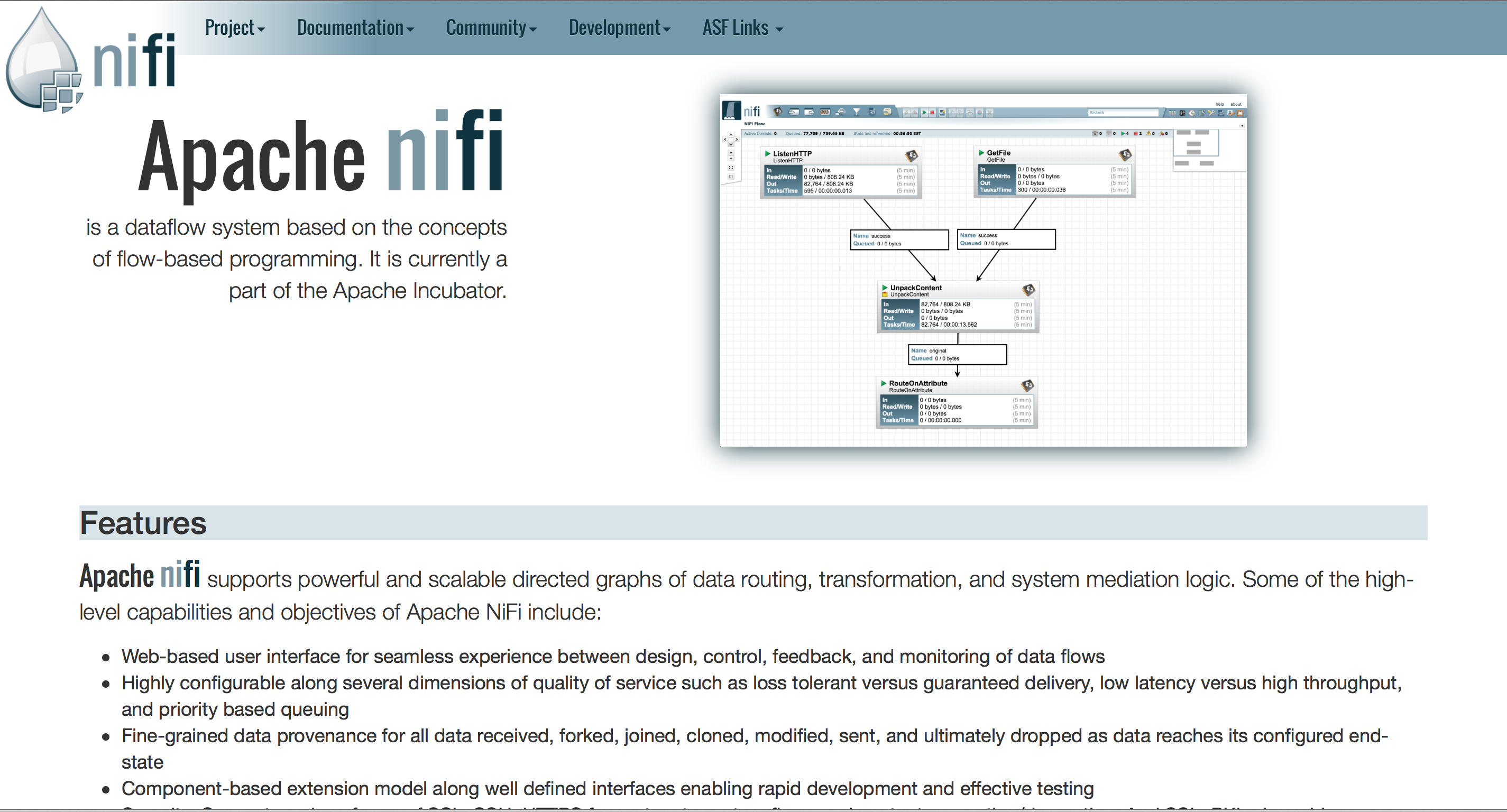
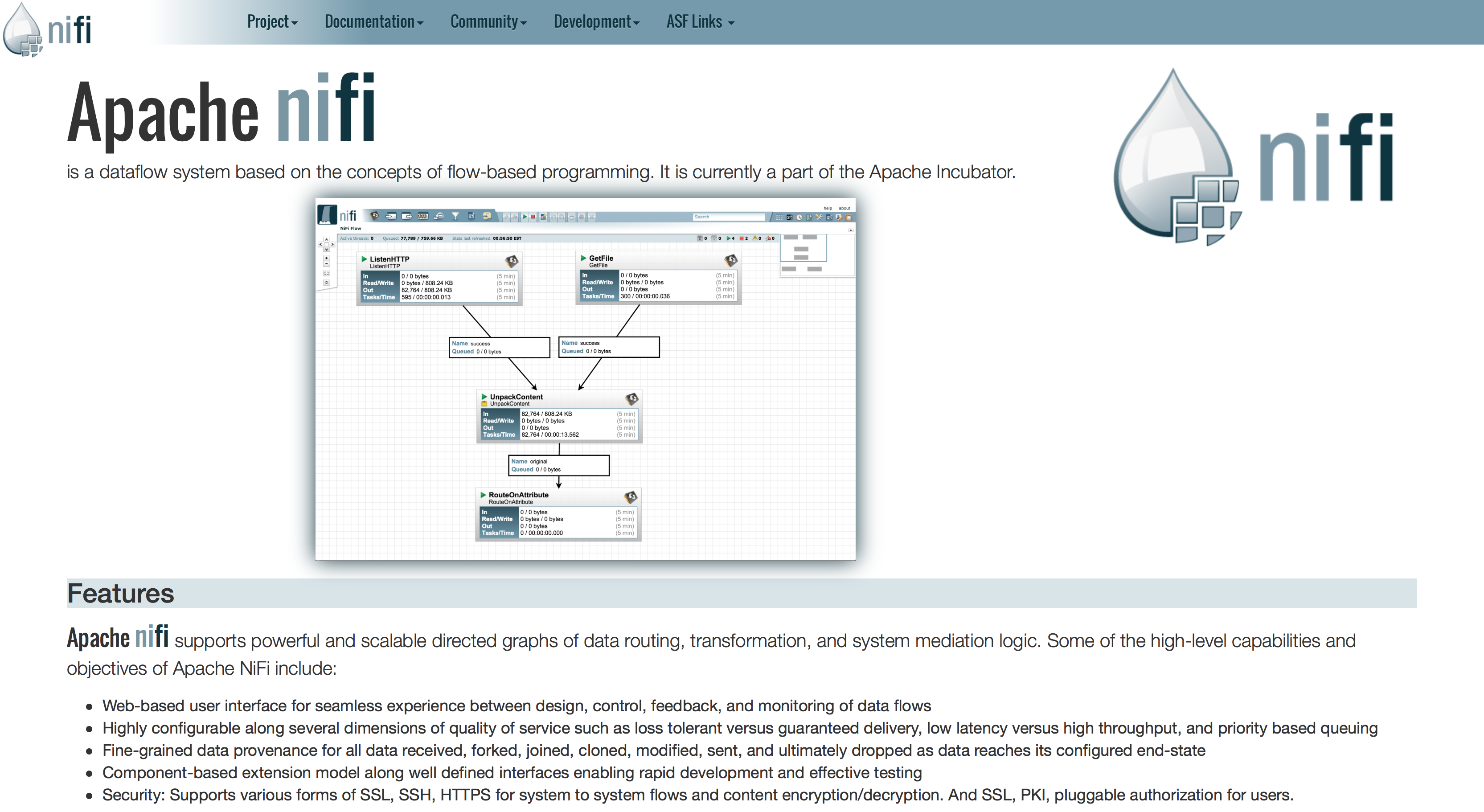
> Mark,
>
> Thanks for the comments.
>
> I actuality tried it without the logo on the main page and it felt a
> bit empty.  I don't know that we necessarily need the logo there, but
> something is needed.  Additionally, I viewed it as being just a "front
> page" inclusion, as other pages would just have the top navbar.
>
> You caught me.  I was lazy and I recycled the screenshot from the
> first iteration.  It would definitely need updating, but is largely
> just a placeholder for the concept.  I would definitely like something
> a bit more engaging.  (faux edit) I rearranged things a bit, removing
> the second instance of the logo and placing more emphasis on the one
> in the corner of the application.  Not sure if I like it better, but
> I've provided the results [1] with all three of the submissions shown
> in chronological order [2].
>
> The news section is a toss-up for me at this juncture.  I could see
> the need one for eventually, but I'm not sure if the project is quite
> there yet.  It seemed a common thread among incubating sites that such
> a section was omitted whereas those top-level projects typically
> included one.  Given that the project is on the verge on the first of
> the regular releases, perhaps this is increasingly pertinent in the
> near future.  At minimum, one of the screen grabs from your blog posts
> would be a good candidate.
>
> [1]
> https://raw.githubusercontent.com/apiri/apache-nifi-site/screenshots/index.html.lite.v1.1.png
> [2] https://github.com/apiri/apache-nifi-site/blob/screenshots/README.md
>
>
> On Tue, Jan 20, 2015 at 10:19 AM, Mark Payne <[email protected]> wrote:
> > Aldrin,
> > I'm liking it! Definitely looks nice. Though I would provide a bit of
> feedback:
> > I'm not sure that I would include the NiFi logo on the right-hand side,
> since it's already in the top-left.
> > From a NiFi 'brand' perspective, I would update the screenshot a bit.
> This screenshot is using the old logo in the top-left corner, and the graph
> shows all of the data disappearing before the RouteOnAttribute Processor.
> I'd recommend we construct a dataflow that's more appealing to the target
> audience, perhaps integrating with other Apache projects (HDFS, Kafka are
> possible, for instance) or using (S)FTP processor.
> > Does it make sense to have maybe like a 'Latest News' section or
> something where we could post things like "Version 0.0.1 just released!"
> etc.?
> > I'm really liking the concept - nice job!
> > Thanks-Mark
> >
> >> Date: Tue, 20 Jan 2015 07:00:52 -0800
> >> Subject: Re: Website Theme
> >> From: [email protected]
> >> To: [email protected]
> >>
> >> I like it.
> >>
> >> On Mon, Jan 19, 2015 at 8:50 PM, Aldrin Piri <[email protected]>
> wrote:
> >>
> >> > I found some time today to provide another look for the site.  There
> >> > were very minor changes to the core HTML as is currently served at
> >> > nidi homepage and it is largely just a stylesheet.  This one is highly
> >> > minimal and clean, still driven by Bootstrap and directly makes use of
> >> > the colors from the UI itself.
> >> >
> >> > A screenshot can be seen at
> >> >
> >> >
> https://raw.githubusercontent.com/apiri/apache-nifi-site/screenshots/index.html.lite.png
> >> > with the associated code under the "lite" branch at
> >> > https://github.com/apiri/apache-nifi-site/tree/lite
> >> >
> >> > Any thoughts are appreciated.
> >> >
> >> > On Tue, Jan 6, 2015 at 9:54 PM, Aldrin Piri <[email protected]>
> wrote:
> >> > > Sorry if this somehow gets sent twice.   My first submission seemed
> to
> >> > > bounce as it exceeded the spam threshold when I sent it a couple of
> >> > > hours ago and it has yet to appear, so I'm sending again.
> >> > >
> >> > > First and foremost, good feedback.  I think UI/UX stuff is tricky
> and
> >> > > I am happy to find my livelihood in the plumbing and behind the
> scenes
> >> > > work.
> >> > >
> >> > > Here's my attempt to try and tackle all the comments in one fell
> swoop:
> >> > >
> >> > > I agree that Bootstrap is everywhere, but I don't necessarily think
> >> > > that is a bad thing.  One could argue that interfaces of all forms
> are
> >> > > converging and users have the instant familiarity of a known
> quantity.
> >> > > I know that I am totally unaware of what it takes to make a site
> both
> >> > > functional and maintain its feel across devices.  I think that last
> >> > > part is important.  Personally, as a user on the other side of the
> >> > > screen, I don't really understand why sites do not work or jive with
> >> > > my mobile device du jour these days; it should just work.  With what
> >> > > little I've learned about UX and "Not Making [Anyone] Think,"[1] I
> >> > > want an effortless experience; no pinch zooming, tap panning, etc.
> If
> >> > > there is a way to take bits and pieces of bootstrap to this end to
> >> > > support that aspect without the cookie cutter air, I would be quite
> >> > > thankful for some guidance on that front and do my best to provide
> it.
> >> > > Out of the box though, the sample looked pretty decent across all
> the
> >> > > devices to which I had access, and used constructs everyone who
> views
> >> > > content through a tiny screen is accustomed.
> >> > >
> >> > > I do agree on the front of the possibility of brand dilution, and I
> >> > > think it is an excellent point for consideration.  As mentioned in
> my
> >> > > original mailing, consideration was given to integrating the
> >> > > application's aesthetics into the core site.  Not sure if this will
> >> > > pan out in an appreciable way as I can see it in my mind, but I do
> >> > > feel it is an avenue worth exploring.  It may also completely miss
> the
> >> > > mark, but with my new found web dev prowess, it should be a much
> >> > > quicker iteration than the first draft.  You'll see a slight homage
> to
> >> > > this via the graph wallpaper that is featured in the application
> >> > > itself.  This was muted a bit by a CSS overlay to a level that
> seemed
> >> > > okay, but I definitely hedged as to whether or not to include it.
> >> > >
> >> > > Ultimately, I wanted to get something out to start the ball rolling,
> >> > > establishing a base for successive iterations.  I know that with all
> >> > > the hard work everyone is putting in, the project is closely
> reaching
> >> > > its first milestone for release, and thought it important to chip in
> >> > > where possible to give a face to the project.
> >> > >
> >> > > Additionally, I think this particular project needs pictures to
> >> > > demonstrate what it's capabilities.  One of the facets that makes
> me a
> >> > > believer about NiFi as a whole is that the end user is not just
> >> > > developers.  Citing the previous example of Accumulo, its intended
> >> > > audience is very technical in nature and, accordingly, a lot can be
> >> > > expressed via the simple phrase of "key-value store."  I would
> contend
> >> > > that NiFi's reach is far broader and can't be done justice with a
> >> > > simple phrase.  For the casual potential user who has strung
> together
> >> > > n-many processes of taking a file, manually transforming it, and
> >> > > moving it elsewhere, they need to see at quick glance that there is
> >> > > something that can automate this tedium and make them more
> effective.
> >> > > Succinctly, the value proposition needs to be there not only for the
> >> > > technical folks who will use this as a framework, but additionally
> for
> >> > > end users.
> >> > >
> >> > > The background for the header isn't awesome, but I knew I wasn't
> >> > > violating any licenses if I generated it myself.  I viewed it more
> as
> >> > > a placeholder than anything else.  Definitely not a front end web
> >> > > developer, even more definitively not a graphic artist.  The colors
> >> > > came from starting with the logo dark blue and running a whole bunch
> >> > > of filters and plugins via GIMP to get something.  Additionally,
> there
> >> > > is a CSS gradient applied over top of it as well when it seemed a
> bit
> >> > > too loud.  It could definitely deal with being muted a bit more.
> >> > >
> >> > > [1] http://www.sensible.com/dmmt.html
> >> > >
> >> > > On Tue, Jan 6, 2015 at 12:57 PM, Tony Kurc <[email protected]>
> wrote:
> >> > >> Hey! It looks awesome! The existing site was put together a
> placeholder
> >> > and
> >> > >> we went with a very generic layout that worked well with Apache
> CMS and
> >> > >> contained all the information expected of an apache process.
> >> > >>
> >> > >> This is a big improvement! For people new to the project, it gives
> a
> >> > nice
> >> > >> upfront screenshot, with big fat links for things I care about
> people
> >> > >> seeing!
> >> > >>
> >> > >> Some things I didn't like about the existing site are the glyphicon
> >> > links
> >> > >> to "external" sites on the menu. I used "link", but I think it was
> >> > meant to
> >> > >> be used for "permalink". Also, we kind of took a best guess about
> what
> >> > >> should go in each dropdown in the menu. I'm pretty sure it could be
> >> > better
> >> > >> organized. I'd also like to see the awesome guides that people
> wrote
> >> > have a
> >> > >> consistent theme with the website and maybe have pdfs so old-school
> >> > folks
> >> > >> can print them out (which may be a dumb idea ;) ) A pet peeve of
> mine of
> >> > >> projects is having a hard time finding the documentation I need,
> like
> >> > >> javadocs or specifications - and keeping around the older versions
> of
> >> > the
> >> > >> documentation. I think we're still working on these - since you
> retained
> >> > >> the menu up top it should be straightforward to have a robust
> >> > documentation
> >> > >> dropdown.
> >> > >>
> >> > >> The blue you used is more of a reddish or purplish blue - the blue
> used
> >> > in
> >> > >> the app is more of a greenish blue. I'm kind of curious what a
> greener
> >> > blue
> >> > >> would look like ... did you mock one up and it looked bad? Or
> maybe a
> >> > more
> >> > >> fundamental question, should the website evoke the theme of the
> app? I
> >> > >> don't know how I feel.
> >> > >>
> >> > >> Tony
> >> > >>
> >> > >>
> >> > >>
> >> > >>
> >> > >>
> >> > >> On Tue, Jan 6, 2015 at 11:59 AM, Joe Witt <[email protected]>
> wrote:
> >> > >>
> >> > >>> I'd say the two sides of the spectrum as examples are:
> >> > >>>
> >> > >>> http://kafka.apache.org/  [super minimalist]
> >> > >>> http://aurora.incubator.apache.org/ [ quite fancy looking ]
> >> > >>>
> >> > >>> Both in my opinion are beautifully done and make it easy to get
> the
> >> > content
> >> > >>> needed.
> >> > >>>
> >> > >>> I think these (and others) provide great examples that both sides
> of
> >> > the
> >> > >>> spectrum have merit.
> >> > >>>
> >> > >>> What is most important to me is that we as a community rally
> behind
> >> > those
> >> > >>> with the expertise and willingness to contribute in this space.
> >> > >>>
> >> > >>> Thanks
> >> > >>> Joe
> >> > >>>
> >> > >>> On Tue, Jan 6, 2015 at 11:34 AM, Joe Witt <[email protected]>
> wrote:
> >> > >>>
> >> > >>> > Both are bootstrap based.  Each is an iterative improvement.
> And we
> >> > just
> >> > >>> > keep iterating as folks have time, willingness, and expertise
> to do
> >> > so.
> >> > >>> >
> >> > >>> > I agree that this new look does not distinguish a brand.  But
> we're
> >> > not
> >> > >>> > mature enough to worry about that yet.  We just need enough of
> the
> >> > right
> >> > >>> > info laid out enough to help grow a community and get folks the
> info
> >> > they
> >> > >>> > need.  We need it laid out in a way that multiple folks can
> >> > contribute.
> >> > >>> > Once we have a release, recruit some committers, demonstrate
> >> > progress on
> >> > >>> > the Apache Way and grow then perhaps branding becomes a bigger
> deal.
> >> > >>> >
> >> > >>> > ..this motivates me to spawn another thread about the type of
> >> > community
> >> > >>> we
> >> > >>> > want to be...
> >> > >>> >
> >> > >>> > Thanks
> >> > >>> > Joe
> >> > >>> >
> >> > >>> >
> >> > >>> > On Tue, Jan 6, 2015 at 11:13 AM, Adam Taft <[email protected]>
> >> > wrote:
> >> > >>> >
> >> > >>> >> This isn't a downvote -- I think it indeed looks good.  But in
> >> > terms of
> >> > >>> >> constructive criticism...
> >> > >>> >>
> >> > >>> >> I think the mockup looks like a very generic "bootstrap" site,
> >> > similar
> >> > >>> to
> >> > >>> >> a
> >> > >>> >> million other bootstrap based sites.  I'd personally almost
> prefer
> >> > the
> >> > >>> >> existing utilitarian website over a bootstrap theme, simply
> because
> >> > it
> >> > >>> >> doesn't try to be anything more than what it is.
> >> > >>> >>
> >> > >>> >> This approach might be an acceptable tradeoff for the project;
> >> > having
> >> > >>> the
> >> > >>> >> bootstrap look & feel is obviously a resource savings and
> available
> >> > at
> >> > >>> the
> >> > >>> >> right price point.  But the site mockup definitely doesn't
> >> > distinguish
> >> > >>> the
> >> > >>> >> Apache NiFi "brand" in anyway. In fact the opposite, the brand
> gets
> >> > >>> >> watered
> >> > >>> >> down with this look.
> >> > >>> >>
> >> > >>> >> As a funny side note, humorously for me, this was the first
> thought
> >> > in
> >> > >>> my
> >> > >>> >> head when I saw the site:
> >> > http://dilbert.com/strips/comic/2010-04-01/
> >> > >>> >>
> >> > >>> >> Adam
> >> > >>> >>
> >> > >>> >>
> >> > >>> >> On Mon, Jan 5, 2015 at 7:39 PM, Aldrin Piri <
> [email protected]>
> >> > >>> wrote:
> >> > >>> >>
> >> > >>> >> > In partial fulfillment of the goals of NIFI-162, I set some
> time
> >> > aside
> >> > >>> >> to
> >> > >>> >> > put together something a bit more visually appealing as a
> face
> >> > for the
> >> > >>> >> > project.
> >> > >>> >> >
> >> > >>> >> > My work can be found at:
> >> > https://github.com/apiri/apache-nifi-site
> >> > >>> >> >
> >> > >>> >> > Currently, work focused around the homepage, but similar
> styles
> >> > would
> >> > >>> be
> >> > >>> >> > applied to more content driven pages minus the large
> headlining
> >> > >>> >> sections.
> >> > >>> >> >
> >> > >>> >> > The relevant technology colophon is provided in the README on
> >> > Github
> >> > >>> >> but is
> >> > >>> >> > primarily driven by Bootstrap, existing image resources
> included
> >> > with
> >> > >>> >> the
> >> > >>> >> > project and current site, and other "artwork" which I created
> >> > myself.
> >> > >>> >> >
> >> > >>> >> > I am neither a UX expert nor am I a renowned front end
> designer,
> >> > so
> >> > >>> all
> >> > >>> >> > input is welcome.  As a "version 1.1" I would like to adjust
> the
> >> > site
> >> > >>> to
> >> > >>> >> > converge more with the application.  Ideas for this are
> inclusive
> >> > of
> >> > >>> >> points
> >> > >>> >> > such as bringing the toolbar styling and color scheme from
> the
> >> > >>> >> application
> >> > >>> >> > to the site.
> >> > >>> >> >
> >> > >>> >> > If this seems like a reasonable path forward and there is
> >> > sufficient
> >> > >>> >> > support, I can look at the next steps to get this integrated
> with
> >> > the
> >> > >>> >> > project, optimization, and integration with the application
> >> > itself.
> >> > >>> >> >
> >> > >>> >> > To aid in showing the intangibles that can't be seen from an
> >> > image, I
> >> > >>> >> have
> >> > >>> >> > a copy of this design hosted at
> >> > http://aldrinpiri.com/apache-nifi/.
> >> > >>> The
> >> > >>> >> > links are currently nonfunctional as they were taken from the
> >> > current
> >> > >>> >> site.
> >> > >>> >> >
> >> > >>> >> > Thanks!
> >> > >>> >> >
> >> > >>> >> > --Aldrin
> >> > >>> >> >
> >> > >>> >>
> >> > >>> >
> >> > >>> >
> >> > >>>
> >> >
> >
>