Nick Sabalausky wrote:
> What font/size do you use?

Depends what program I have open. But it's one of these three:
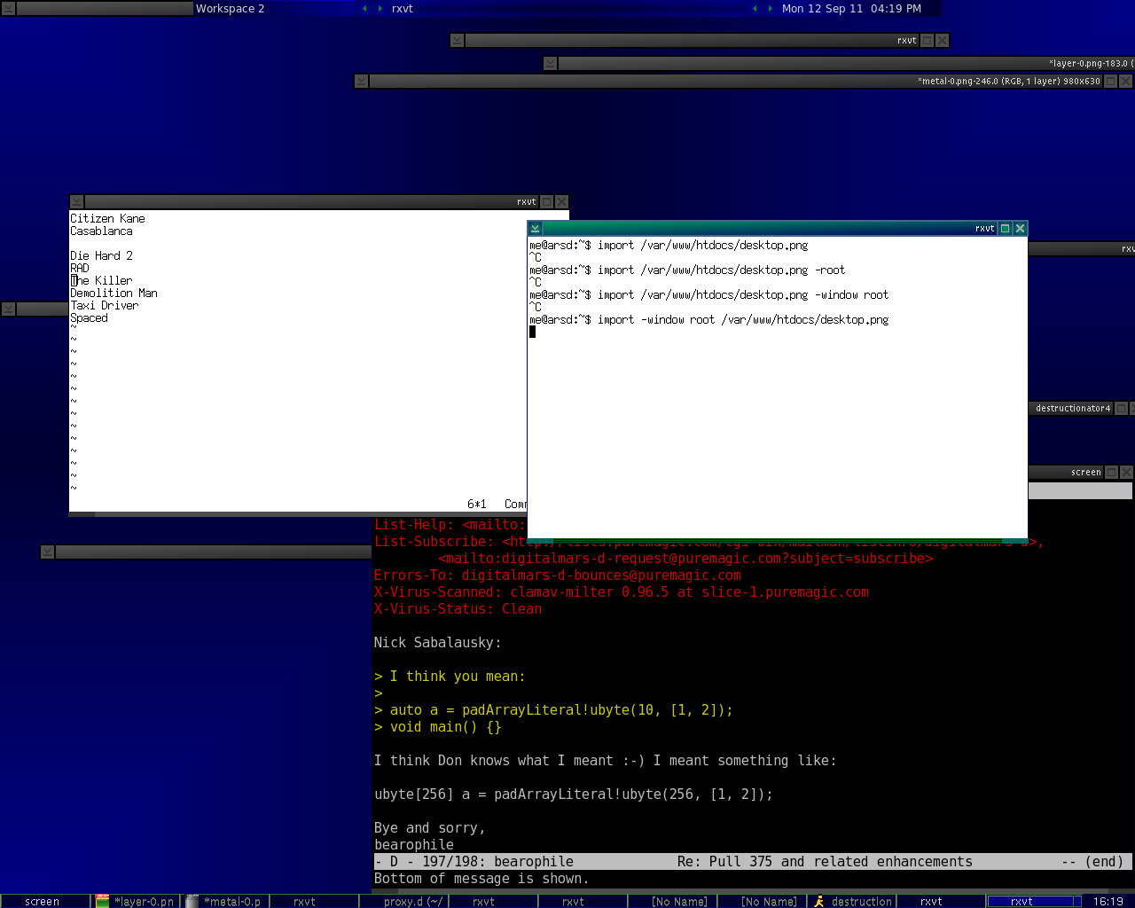
fixed size 14 (pixels probably) on linux. (it's a bitmap font that
is rxvt's default for me)

bitstream vera monospace size 16.. I think.. if I spring for the
fanciness of an xterm.

and the putty default, which I believe is Courier New, 10 point, if
I'm on Windows.


Might be more informative to use a screenshot:

http://arsdnet.net/desktop.png

the white windows are the kind of thing I use for code most often.

The email window shows the other linux font.


> Fuck these stupid imperial units.

Imperial units are superior.

"It's zero degrees out." 0 F is actually pretty cold.

0 C is slightly chilly, but nothing to get worked up about.


Inches beat centimeters any day of the week. Just like with
kilometers, centimeters are useless. (ever gone on a kilometer
run? Weak. Mile runs are where it's at.)

You're always going to be doing some multiple or fraction.
English units go naturally to fractions - following very useful
powers of two!

A half inch is... well, half an inch. You can eyeball the middle
of a full inch and be on target.

What if you want half a centimeter? Now it's some vile 5 mm...
still workable though.


Turns out that didn't fit either. Let's cut in half again.

English: 1/4 inch. Sane.

Metric: 2.5 mm.... gross! So then you have 2mm sometimes, and 3mm
sometimes, and it's just a pain to eyeball the difference.

> Maybe I've lost my mind, but I could swear american
> rulers and tape measures always used to have imperial along one
> side and metric along the other.

My ruler and square have both, but my yard stick and tape measure
are only imperial...

> (I might do things differently if I were on a widescreen, though.

I suspect it's more of a focus model matter. at least for me. (I
just refuse to use widescreens, so no big experience there)

If clicking a window raises it, it's a pain to stack, since they
keep covering each other in underdesired ways. Might as well just
maximize it.

But, when I can turn that dreadful behavior off, I avoid
maximization whenever possible, since I actually can use the
whole thing.


Anyway on indent size again, I think the biggest problem with me
is more outdents rather than indents.

if using_ugly_language:
    "i see this change despite being 4 chars"
    if spanish_inquisition:
        "nobody expects"
        "amongst our weaponry are such diverse elements as"
"i can totally miss this"


That last line will mess up my brain. Maybe I'm just so used to
eight character indents, but when I see that change, it almost
always registers as a single change in level.

The indents aren't too bad, since at least there's a block of
stuff surrounding it. It's still easy for me to skip past, but
not a huge deal.


But, outdents are harder to see. I think part of it is I'm so used
to seeing changes of 8 that 4*2 = 8*1, so I register one change
instead of two.

Closing braces help a lot though, since seeing two braces going out
very clearly marks the end of /something/.

            writeln("eating is fun");
        }
    }

Not ideal, but it at least works for me.