when I talk about 'wrong units' I mean 'wrong scale'

Units are right (ºC - mm )
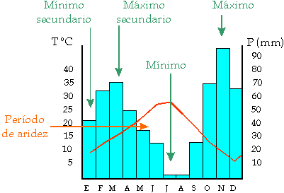
sorry

El lunes, 12 de agosto de 2019, 15:29:30 (UTC+2), Pepe escribió:
>
> Hi Andrew
>
> this is how my graphs.conf looks like
>
>
>  [[chart8]]
>
>        title = "Climograma ~ Junio a Diciembre de 2019"
>        subtitle = P total y T media mensual (media de la temperatura
> media diaria de cada día del mes)
>        time_length = year_specific
>        year_specific = 2019
>        aggregate_interval = 86400 # 1 day
>        xaxis_groupby = month
>        xaxis_categories = 'Junio','Julio', 'Agosto', 'Septiembre',
> 'Octubre', 'Noviembre', 'Diciembre'
>
>         [[[outTemp]]]
>
>             name = Temp media
>             type = spline
>             aggregate_type = avg
>             color = "#fc0404"
>             zIndex = 2
>
>         [[[rainTotal]]]
>             name = Precip total
>             type = column
>             aggregate_type = sum
>             color = "#438bd6"
>             yAxis = 1
>             yAxis_tickinterval = 10
>             yAxis_min = 0
>             zIndex = 0
>
> And this is how my chart looks like: (two decimals instead of one and
> wrong units)
>
>
> This how I would like: (scale right and left)
>
>
>
> El lunes, 12 de agosto de 2019, 13:43:33 (UTC+2), Andrew Milner escribió:
>>
>> have you set the tick interval for each of the measurements you are
>> plotting?
>>
>> maybe if you attached the relevant part of the .conf we would have a
>> better idea of what you are actually plotting, and what parameters you have
>> set (or not set)
>>
>> what is actually happening - can you also attach a png of your plot - or
>> give a link to your website and say what exactly is wrong.
>>
>>
>>
>>
>> On Monday, 12 August 2019 14:02:09 UTC+3, Pepe wrote:
>>>
>>> Hi Pat
>>>
>>> I know yaxis_tickinterval but I cannot achieve the chart in the way that
>>> I want it. This is how could it be:
>>> https://upload.wikimedia.org/wikipedia/commons/9/94/Esquema_climogramas.png
>>>
>>> The values of the axis are very important because they are showing (in this
>>> way) more efficiently the presence of dry season; this is the reason of my
>>> doubt.
>>>
>>> thank you.
>>>
>>> El domingo, 11 de agosto de 2019, 18:59:05 (UTC+2), Pat escribió:
>>>>
>>>> For the observation which you have specified yaxis = 1, you also
>>>> should specify the yaxis_tickinterval
>>>> <https://github.com/poblabs/weewx-belchertown/wiki/Belchertown-Charts-Documentation#yaxis_tickinterval>
>>>>
>>>> if you want more ticks on the yaxis.
>>>>
>>>> On Sunday, August 11, 2019 at 11:52:33 AM UTC-4, Pepe wrote:
>>>>>
>>>>> Correction: In red what I meant
>>>>>
>>>>> *Hi*
>>>>>
>>>>> *I am triying to draw a climate graph but I want to put doble values
>>>>> in the right than left . For example if I got 20 in the left must be 40
>>>>> in
>>>>> the right, that is to say, the rainfall scale must always be twice that
>>>>> of
>>>>> temperature. Attached the graph I get with precipitation scale column
>>>>> wrong.*
>>>>>
>>>>> *Any idea?*
>>>>>
>>>>>
>>>>>
>>>>>
>>>>> El sábado, 1 de junio de 2019, 18:57:56 (UTC+2), Pat escribió:
>>>>>>
>>>>>> Belchertown skin 1.0 is released!
>>>>>>
>>>>>> This update contains a lot of updates and changes including *an
>>>>>> entire rewrite of the Highcharts system* which allows you to make
>>>>>> almost any graph you want for almost any time span you want. You can see
>>>>>> some examples of the charts you can make on the BelchertownWeather.com
>>>>>> website graphs page
>>>>>> <https://belchertownweather.com/graphs/?graph=all>.
>>>>>>
>>>>>> You can add/remove/change/reorder any chart, change colors, add
>>>>>> observation plots, categorize for all time. Almost anything you want to
>>>>>> do
>>>>>> is available! The skin comes with the standard 4 charts ready to go, but
>>>>>> there's extensive Belchertown Charts Documentation
>>>>>> <https://github.com/poblabs/weewx-belchertown/wiki/Belchertown-Charts-Documentation>
>>>>>>
>>>>>> which can help you get started.
>>>>>>
>>>>>> In addition to the Charts there's now a dark mode (which has an
>>>>>> auto-switching mode based on sunset/sunrise), more flexibility for
>>>>>> translations, user customized station observation table which is updated
>>>>>> in
>>>>>> real time if the MQTT Websockets are enabled, and a lot more. Check the
>>>>>> release notes for all the details!
>>>>>>
>>>>>> You can download the latest release here
>>>>>> <https://github.com/poblabs/weewx-belchertown/releases/download/weewx-belchertown-1.0/weewx-belchertown-release-1.0.tar.gz>,
>>>>>>
>>>>>> and read all of the details on the changes here:
>>>>>> https://github.com/poblabs/weewx-belchertown/releases
>>>>>>
>>>>>> *Note: You cannot upgrade from Belchertown 0.9 and older*. You must
>>>>>> uninstall everything and reinstall new. This is due to the Chart system
>>>>>> being fully rewritten and the potential for conflicts. Please read
>>>>>> this upgrade guide if you are upgrading from an older version of
>>>>>> Belchertown skin
>>>>>> <https://github.com/poblabs/weewx-belchertown/wiki/Upgrading-to-Belchertown-skin-1.0>
>>>>>> .
>>>>>>
>>>>>> Thanks to all the beta testers and translators over the last couple
>>>>>> of months help me iron out all the kinks and shape the skin in a way
>>>>>> that
>>>>>> can be translated a little easier!
>>>>>>
>>>>>> Attached are some examples of the charts that can be made. If you
>>>>>> find any issues, you can reply here or open an issue on the
>>>>>> Belchertown skin GitHub page
>>>>>> <https://github.com/poblabs/weewx-belchertown>.
>>>>>>
>>>>>

--
You received this message because you are subscribed to the Google Groups
"weewx-user" group.
To unsubscribe from this group and stop receiving emails from it, send an email
to weewx-user+unsubscr...@googlegroups.com.
To view this discussion on the web visit
https://groups.google.com/d/msgid/weewx-user/71d18649-09a3-4163-8b80-222daee72dd5%40googlegroups.com.