Hello,

> >
> >         Tangerine is a tangoish Human theme that blend very well
> >         with other Tango icons.
>
> Well, I don't know what happen there but aren't all three are supposed
> to follow the same guidelines and palette? Can't imagine otherwise.
Obviously does Human *not* follow Tango guidelines. It was discussed
earlier.
> I agree the fonts are very bad but you can't say Tangerine is very
> clean and readable (there's nothing to read!).
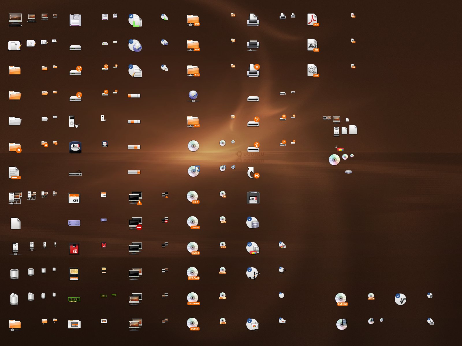
Those tiny icons give the information users want : is this places a
device ? is this places local or remote ? Most users don't care about
which protocol is used. That might be even disturbing for people which
does not understand that, especially smb (people search for Windows
Share) and dav that is auto detected with avahi.
Latest update of Tangerine include this in Changelog :
- icons for dav, ftp, smb and ssh by Lapo
Here is a screenshot :
http://bersace03.free.fr/pub/captures/dapper-artwork/tangerine-0.11.png
Sadly, dav icons is not properly use. The same problem appear with smb
icons which are *very* comprehensive for user. That might be a naming
problem. The ssh icons with a shield means the protected connection by
ssl. That is meaningful. Ftp is not so readable, if find it hard to
understand the moving file/directory.
> It's one and the same icon for three types and that is not useable. So
> while the font needs to be cleaned up in Human at least its there, and
> is somewhat useable. Not true for Tangerine.
Users largely prefer less than confusing/ugly.
> I do see blurry icons.
And that is not polished nor realistic.
> Tango doesn't have this problem at small sizes because it doesn't use
> shadows at small sizes. I agree that if it is not done right, that is
> the best route to take. However a lot of the small Human icons look
> good so, picking out a few means nothing when it is a WIP.
There are not few. Almost all icons that comes from Human are blurry
where Tangerine icons are very clean and readable. I'm still waiting for
a real polished Human icon theme. This is the case for games category,
show desktop icons, etc. See all tiny icons in
https://wiki.ubuntu.com/DapperUbuntuIcons?action=AttachFile&do=get&target=desktop-icons.jpg
WIP ? but where is the Changelog ? Tangerine seems more open than Human.
> Not true. They were to be Humanified Tango. You got it backwards.
Nop. As said at https://wiki.ubuntu.com/ArtworkTeam/TangerineIcons
Tangerine is a tangoification of Human. Sorry but *You* got it
backwards.
> Human looks fine with Tango, so perhaps your issue is that Human
> inherits from Tangerine and shouldn't.
Nop. This is fact that Human does not blend well with Tango. This was a
base target of Tangerine : conciliate Human and Tango. (formerly
OrangeTango)
> As an themer, I care more about realistic shadows than a minor
> consistency issue that is bound to change over time. If I can't enjoy
> my desktop....if I don't feel the icon is a realistic interpretation
> of what it represents, I won't notice the color inconcententcies
> because I won't be using the icon theme!
If you care about realistic icons, then forget all the glassy effect of
directory, computer and other Human icons !!! Tango and Tangerine
shadows are nicer than you admit.
> The most important is to be realistic, whether that be a cartoonish
> (or whatever) feel doesn't matter.
You should really consider consistency and accessibility.
> What matters is that we feel like we are looking at what the artist
> wanted us to.
sorry but icons are not just art. This is also a matter of usability.
for example : Gargantua icons are very nice, but not usable by every
one. A lot of icons in Human (may) have reallistics shadow but are
unusable for people. (see the test i made with my father which wear big
glasses).
What make Windows icons ugly (even Vista) is not ther irrealistic look,
but the mix with old win95 icons. What make Mac OS X icons beautiful and
even famous is not their realistic glassy effect, but their consistency.
Usability, Readability and consistency are more important than realism.
Tango spec are about consistency, readability and usability. It let
artist make them realistic or not, given it follow the spec, it get
consistent.
Just a question, are you the guy who decied which iconset is used by
default ?
Étienne.
--
ubuntu-art mailing list
ubuntu-art@lists.ubuntu.com
https://lists.ubuntu.com/mailman/listinfo/ubuntu-art